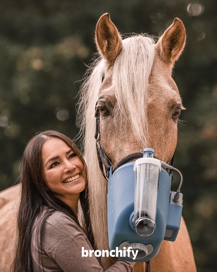


Like a good ride, it’s all in the spacing:bronchifybreathes easy,Kitsets easy. The German company that’s concerned with“all things related to your horse’s respiratory health” recently rebranded. The newly introduced logo combinesKit SansandKit RoundedbyDarden Studio. Being cut from the same cloth, the two typeface styles naturally go together well. The Sans is more formal and ensures the reliability expected of a medical brand. The Rounded – which, quite unusually, came first in Kit’s design process – adds a good deal of approachability.The notch in theyworks as extra eye-catcher. Thelast two letters areadditionally highlighted through color. Consequently, they stand out from the wordmark, and can also be read as addressing the customer: “fy” as in “for you”. The compact version of the logo as seen for the favicon retains the combination of Kit Sans and Kit Round. Kit is also used for other touchpoints. Shown below are the “Bronchies”, a team of brand ambassadors in the form of cute characters related to horses and their lungs. Names in bold caps from Kit Rounded are supported by copy inProxima Nova.
This typography communicates veterinary expertise wrapped in approachable warmth—a medical authority that doesn't intimidate horse owners. The combination creates a "trusted friend who happens to be a doctor" energy, balancing professional credibility with the gentle, nurturing care associated with animal health.
Kit Sans and Kit Rounded work perfectly because they're literally designed as complementary siblings, sharing DNA in their letterform construction while offering formal vs. friendly expressions. The rounded terminals soften medical sterility without compromising legibility, while Kit Sans maintains the structural integrity needed for pharmaceutical trust. The shared x-height and stroke weight create seamless visual flow even when mixed mid-word.
This isn't just font pairing—it's typographic code-switching within a single wordmark. The Sans-to-Rounded transition mirrors the brand promise: clinical expertise that becomes gentle care. The system creates hierarchy through formality levels rather than size, with Proxima Nova providing neutral, highly-legible support text that doesn't compete with the distinctive Kit personality.