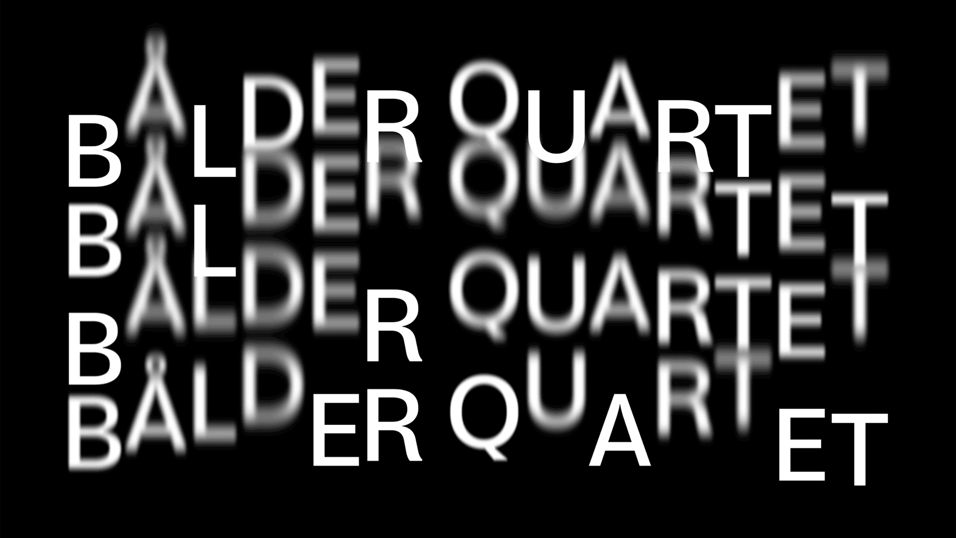
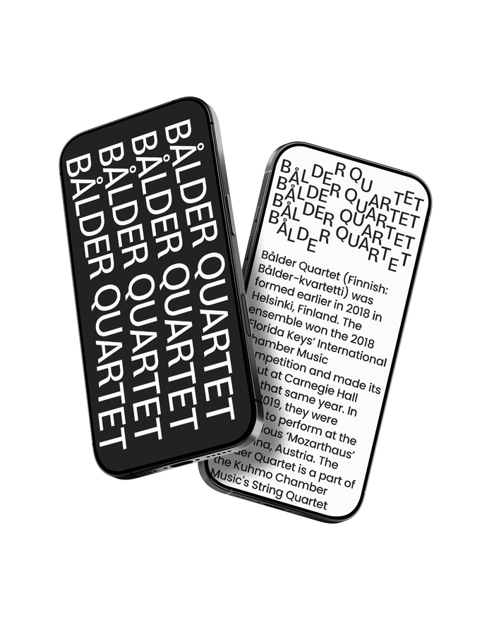
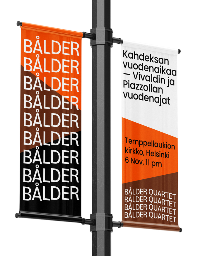
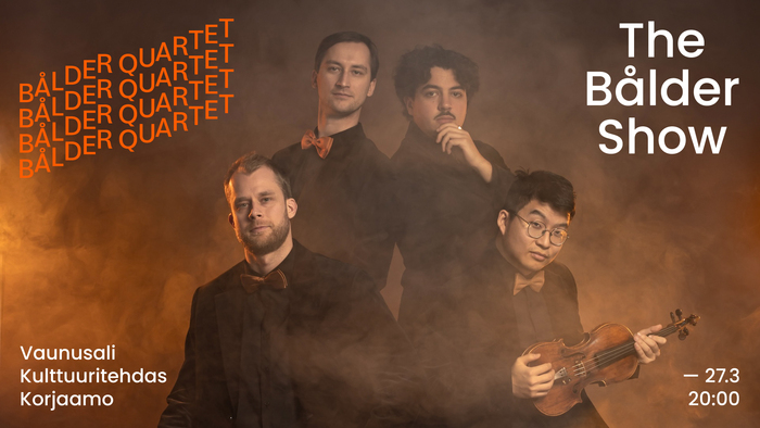
Bålder Quartetis a Finnish string quartet playing classical music together since their launch in 2018. In January 2026 they revealed a new visual identity, designed byDavid Matos/ShutupandanceusingPoppinsthroughout, plusBloydfor the logo. The stacked lines symbolise the core composition of a string quartet. It alludes to the two violins, the viola and the cello (and, by extension, the four musicians). Each line can also be seen as representing the four strings, common to all instruments in the quartet. The logotype can take on different shapes by shifting characters, together or individually, along their vertical axis (i.e. baseline), evoking the sensation of sound, music, and rhythm. It can be animated in several ways — for example, reacting to sound as a backdrop projection in live settings.
The typography communicates precision-meets-expressivity—a rational foundation with dynamic flourishes. Bloyd's geometric construction provides structural clarity for the animated logo concept, while its slightly rounded terminals soften the mechanical feel. The bouncing baseline system transforms static letterforms into rhythmic notation, creating brand energy that mirrors the controlled improvisation of chamber music performance.
Bloyd's geometric form model serves the animated logo concept perfectly—its constructed letterforms maintain legibility even when vertically displaced along shifting baselines. The typeface's consistent stroke weight and circular geometry create visual stability while allowing for dynamic movement that doesn't compromise character recognition. Poppins extends this geometric logic into text applications, sharing Bloyd's rational construction but offering the weight range and optical refinement needed for hierarchical information systems.
This is a textbook example of harmonious pairing through shared form model—both fonts operate within the geometric matrix with similar constructed logic and circular forms. The pairing creates cohesion rather than contrast, with differentiation achieved through application (logo vs. text) rather than structural opposition. This strategic restraint reinforces the quartet's unified artistic vision while allowing the animated baseline concept to remain the primary differentiator.