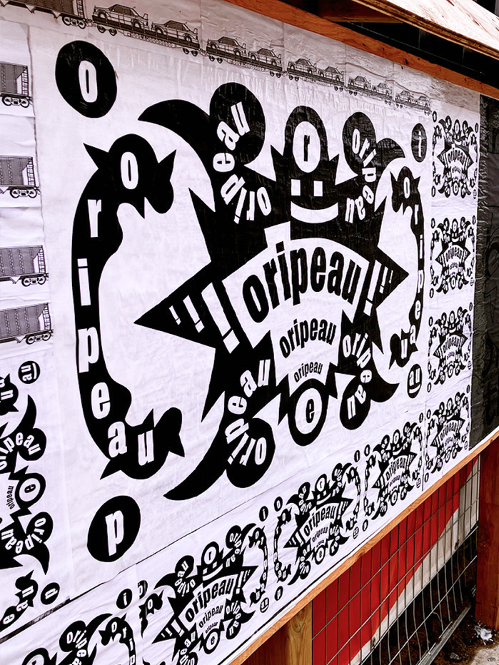
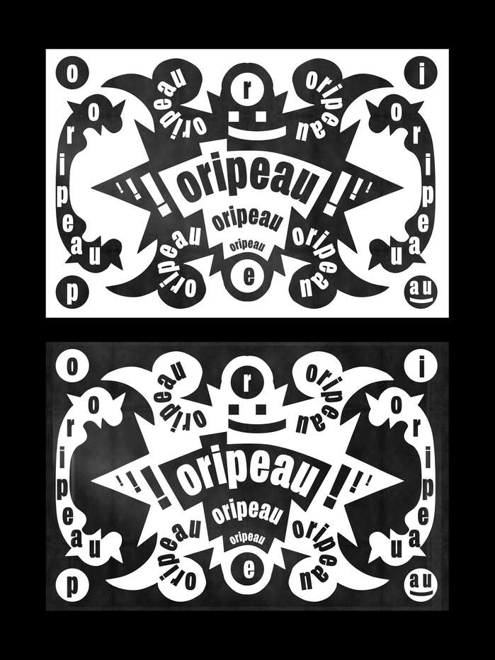
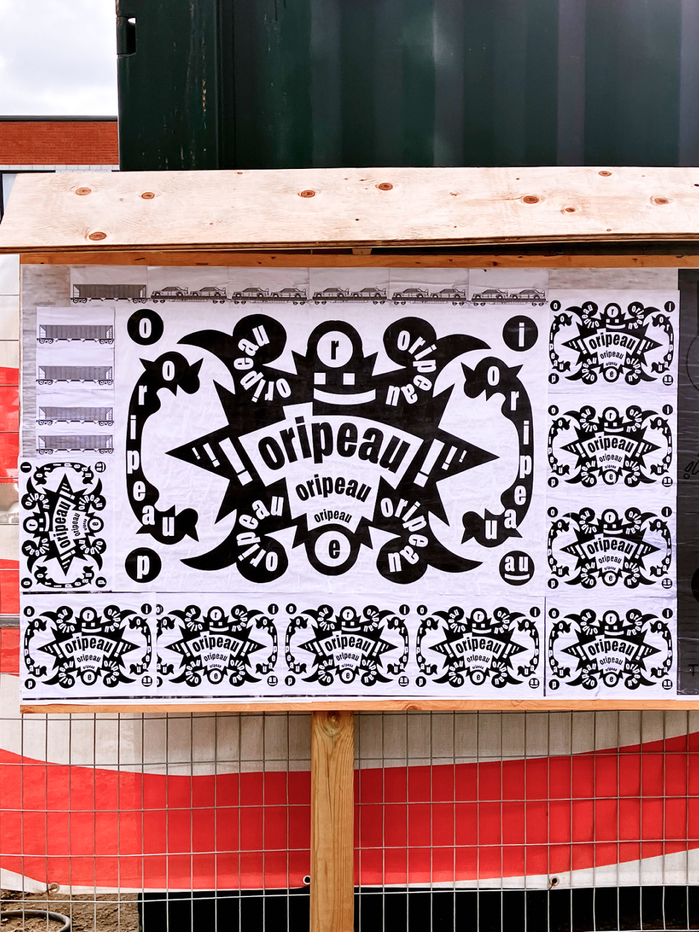
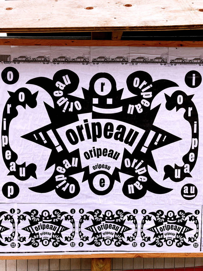
A couple of years ago, I accidentally came across theOripeauproject, which immediately and permanently sunk into my soul. They help designers and any kind of artists showcase their works for free in public spaces in Nantes (France) and Montréal (Canada) — to the delight of both of artists and visitors. Usually the works are exhibited within one week, and new submissions are reviewed in October and April — more info onoripeau.art The poster “Oripeau, Oripeau, Oripeau” was designed out of love and in support of the project and put on display in Montréal at the end of November 2025. The shape was made of paper and scissors. The font in use isFL Art GroteskfromContemporary Type, designed byAlex Slobzheninov.
FL Art Grotesk communicates a refined cultural sophistication that balances artistic gravitas with approachable warmth. The grotesque's clean geometry and balanced proportions convey institutional credibility while maintaining an unpretentious, community-focused spirit that aligns perfectly with Oripeau's mission of democratizing art display in public spaces.
FL Art Grotesk's moderate x-height and balanced character proportions ensure excellent readability when curved along the paper silhouette, while its neutral grotesque structure doesn't compete with the handcrafted paper-cut aesthetic. The font's contemporary refinement elevates the grassroots project without appearing elitist, and its weight range provides clear hierarchy when the name is repeated three times in the composition.
As a single-font system, FL Art Grotesk creates hierarchy through repetition and scale variation rather than contrasting typefaces. The threefold repetition of "Oripeau" at different sizes establishes a rhythmic emphasis that mirrors the project's cyclical exhibition schedule, while the consistent typeface maintains visual cohesion across the organic, hand-cut silhouette form.