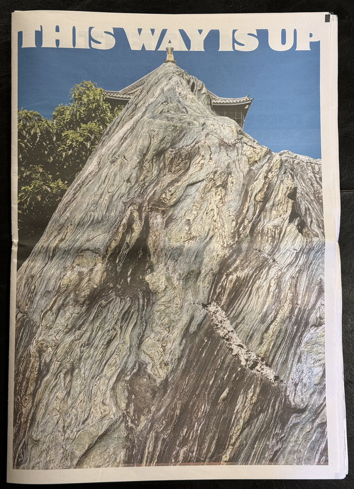
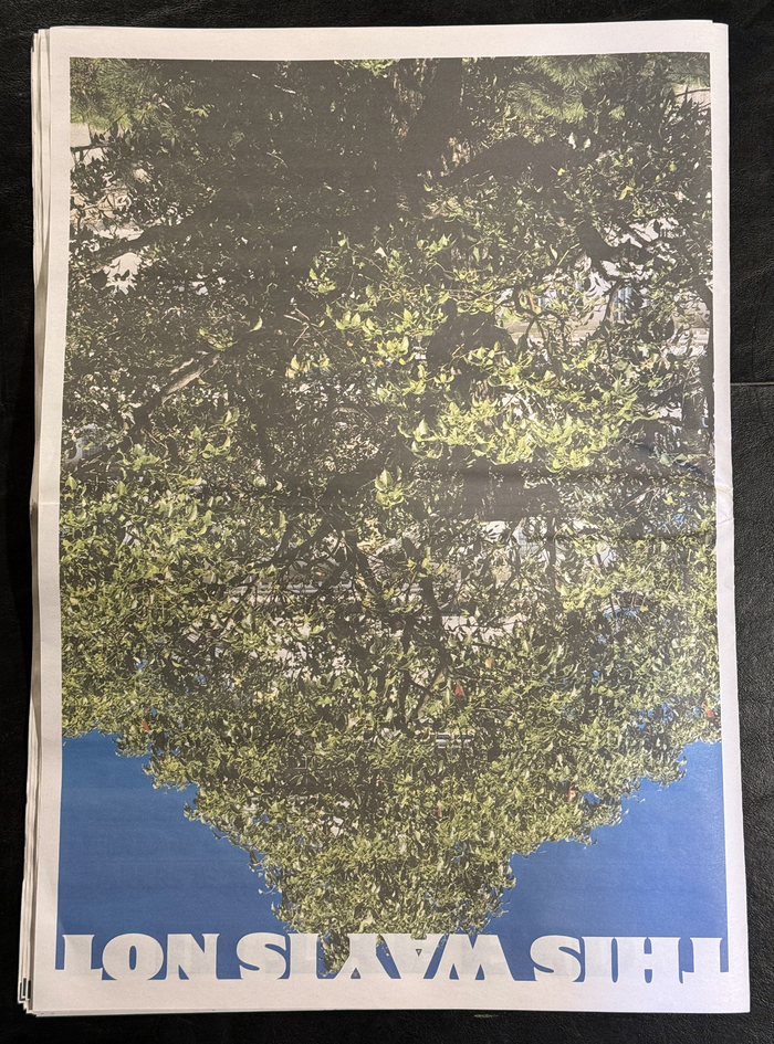
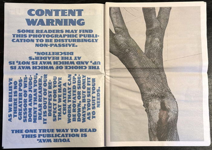
PhotographerWoo See-Mingdesigned and published this48-page collection of color photographyin a broadsheet newspaper format (13.5″×18″). The book has essentially two covers, one on each side. The inside pages follow the orientation up to the center spread, which has no obvious orientation. All the text and headlines are set all caps inGertiebyMark Simonson Studio.
Gertie communicates a bold, directional experimentalism that mirrors the book's multi-directional concept. The extra bold weight creates an assertive, almost industrial energy that transforms the intimate nature of photography into something architecturally commanding and spatially disorienting.
Gertie's extra bold weight and geometric construction provide the visual anchor needed for a disorienting, multi-directional layout concept. The typeface's sturdy letterforms maintain legibility even when rotated or inverted, while its condensed proportions maximize impact within the broadsheet format's generous scale. The all-caps treatment creates consistent visual rhythm across varying orientations.
Using a single typeface in all caps creates typographic unity that supports rather than competes with the conceptual complexity of multi-directional orientation. The monolithic approach lets Gertie's extra bold weight create hierarchy through scale and positioning rather than stylistic contrast, maintaining clarity within an intentionally confusing spatial experience.