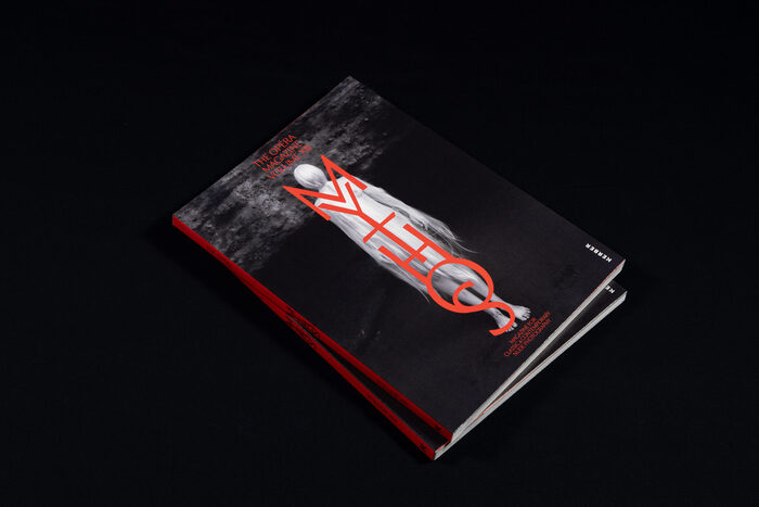
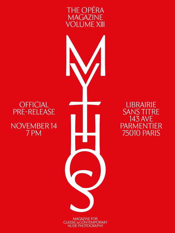
The thirteenth volumeofThe Opérarevisits the nude as myth, ritual and revelation. Entitled “Mythos”, this edition draws from ancient tales to explore the body as both symbol and subject, blending photography, philosophy and poetry into a timeless narrative. The publication is edited by Matthias Straub and designed byStudio Tillack Knöll(Stuttgart), who bring a refined visual structure to the issue. Typography is central to this composition:TWK Issey, a high-contrast serif designed byRIMASÙU Studioand published by WELTKERN®, is used throughout. With its balance of delicacy and authority, TWK Issey captures the tension between vulnerability and divinity that defines the volume. Its sculptural forms echo the photographs’ quiet intensity and lend a contemporary grace to every page. A typeface that speaks with clarity, reverence and restraint. To view this video please enable JavaScript, and consider upgrading to a web browser thatsupports HTML5 video
TWK Issey communicates a cerebral sensuality—the kind of refined eroticism found in art museums rather than mass media. Its high-contrast strokes create a tension between academic authority and bodily vulnerability, perfectly embodying the publication's exploration of nudity as both myth and revelation. The typeface suggests intellectual intimacy, speaking to readers who appreciate both flesh and philosophy.
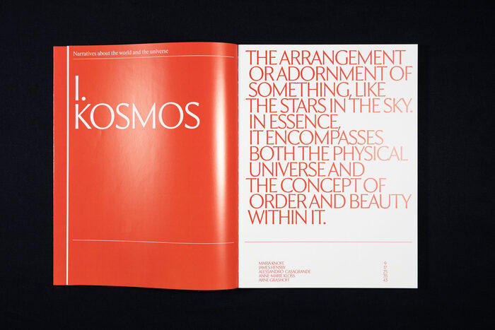
TWK Issey's sculptural high-contrast serif structure mirrors the volume's thematic tension between divine and human forms. The dramatic thick-thin stroke relationship creates visual intensity that matches the photographs' quiet power, while its refined proportions and classical serif foundations provide the editorial gravitas essential for serious cultural discourse. The typeface's delicate details and authoritative presence allow it to handle both body text and display applications with equal sophistication.
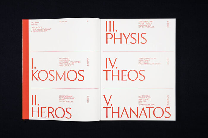
As a single-font system, TWK Issey creates internal hierarchy through its range of weights and the careful manipulation of scale, spacing, and color. The high contrast inherent in the letterforms provides enough visual tension to maintain reader engagement across long-form content, while the consistent stylistic voice ensures thematic coherence throughout the issue's blend of photography, philosophy, and poetry.