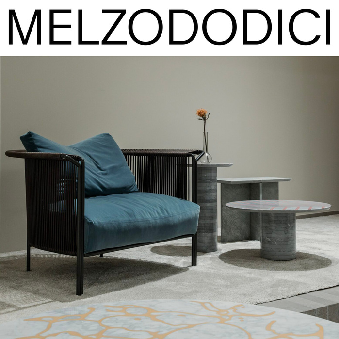
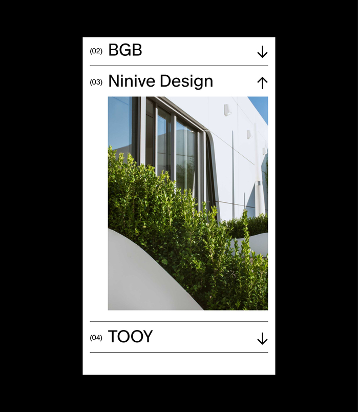
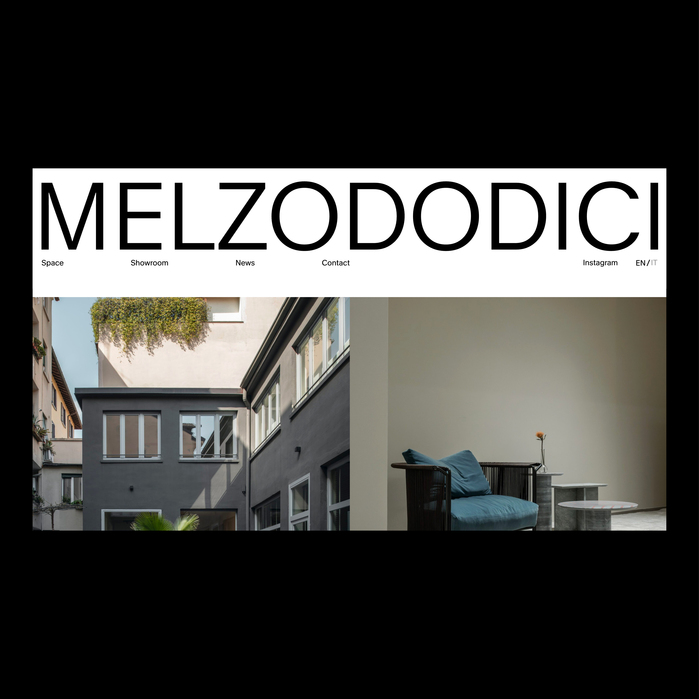
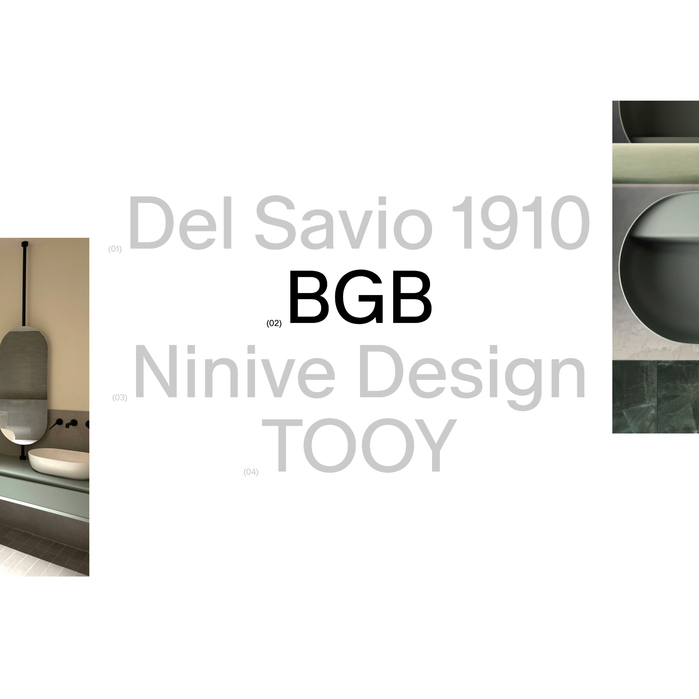
TheMelzoDodici websitewas designed byDuo Visionusing the fontsMelange GroteskRegular and Light. MelzoDodici is a hub for design and events in Milan. Showroom, collaborations and versatile location ready to adapt to any vision. MelzoDodici is a dynamic space where design, creativity and events come together. A place designed for brands, professionals and companies looking for meaningful connections and new opportunities. From the showroom to bespoke collaborations, every project is a unique experience.
The typography communicates a refined, architectural minimalism with contemporary European sophistication. Melange Grotesk's geometric foundation and varied weight range creates a sense of measured precision and design authority, perfectly suited for a Milan-based creative hub that positions itself as both accessible and professionally elevated.
Melange Grotesk's clean geometric structure and generous x-height provide excellent readability across digital applications while maintaining design credibility. The font's subtle humanist touches prevent sterility, while its extensive weight range (Regular to Light showcased here) allows for sophisticated typographic hierarchy that reflects the brand's design expertise and Italian attention to craft.
The strategic use of Melange Grotesk's weight contrast between Regular and Light creates elegant internal hierarchy without introducing visual noise. The Light weight adds breathing room and sophistication to secondary information, while Regular anchors key messaging with appropriate authority—a single-family approach that demonstrates typographic restraint and professional confidence.