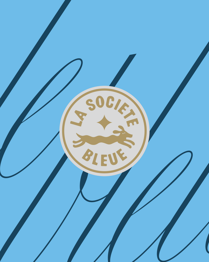
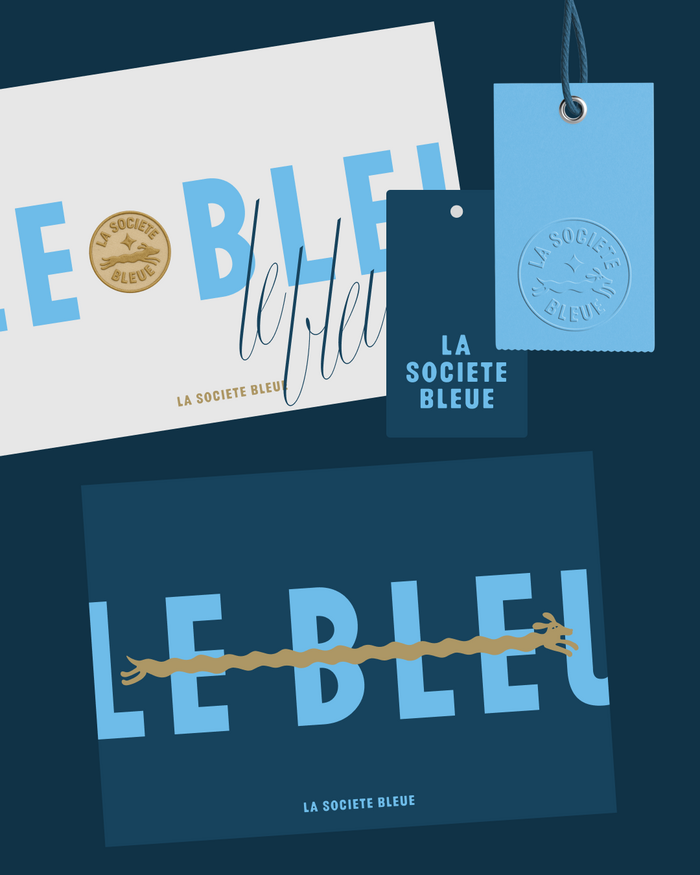
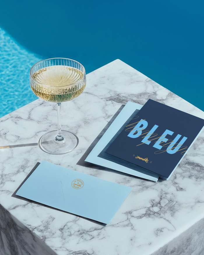
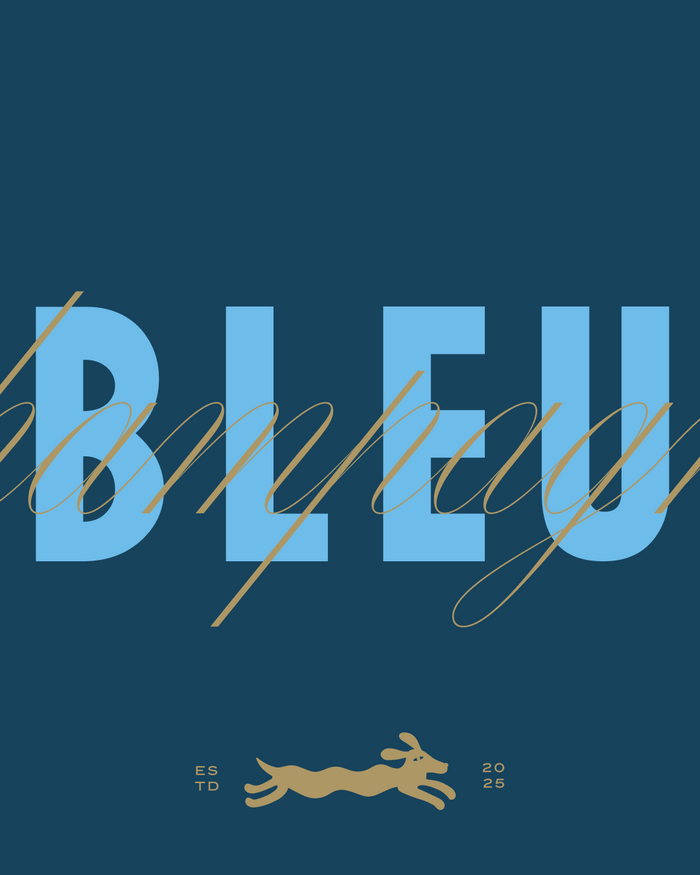
La Société Bleuefeels like an afternoon on the Riviera. The name sets the tone: French, clear, elegant. Blue as a mood, a color, and a symbol. In the branding of the Stuttgart-based brand of cashmere pullovers, this translates into a finely tuned color system based on different shades of blue complemented by gold accents. The colors elegantly convey depth and character. The logo itself combines maritime lightness with a touch of vintage usingMaroniin its Regular weight. It’s complemented by the teckel symbol – abstracted, stylized, as a figure. It appears on labels, clothing, and accessories; as a mascot, key signet, and well-thought-out element in the visual system. The accompanying typefaces areCarta NuevaandSign Maker JNL.
La Société Bleue embodies refined French coastal leisure—the kind of effortless sophistication found in Saint-Tropez boutiques or Monaco yacht clubs. The typography communicates cultured accessibility: upscale enough for discerning taste but approachable enough for everyday luxury, with maritime heritage woven through contemporary continental style.
Maroni's humanist serif provides elegant legibility with subtle calligraphic warmth, its moderate contrast and refined terminals suggesting French typographic tradition without stuffiness. Carta Nueva's clean geometry offers contemporary balance, while Sign Maker JNL's vintage signage DNA adds authentic maritime character. The combination creates layered sophistication—formal enough for luxury positioning, personal enough for lifestyle connection.
This three-font system creates sophisticated hierarchy through stylistic tension: Maroni's refined serif authority anchors the brand name, Carta Nueva's neutral geometry handles information gracefully, while Sign Maker JNL's vintage character adds authentic maritime storytelling. The contrast between contemporary clean lines and weathered coastal signage history creates rich narrative depth.