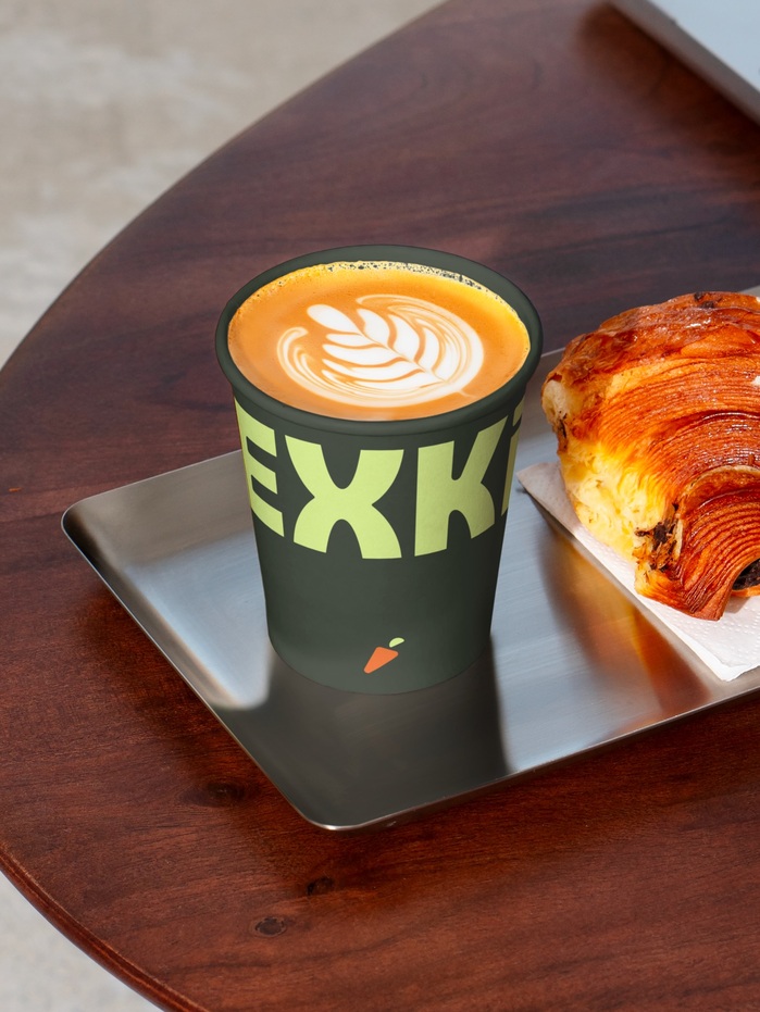
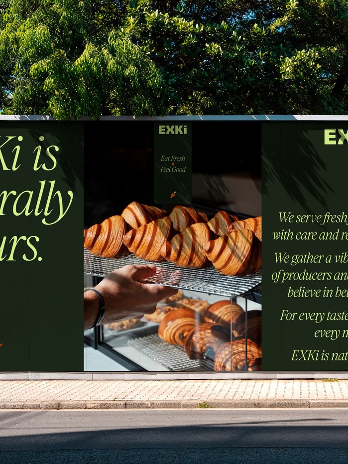
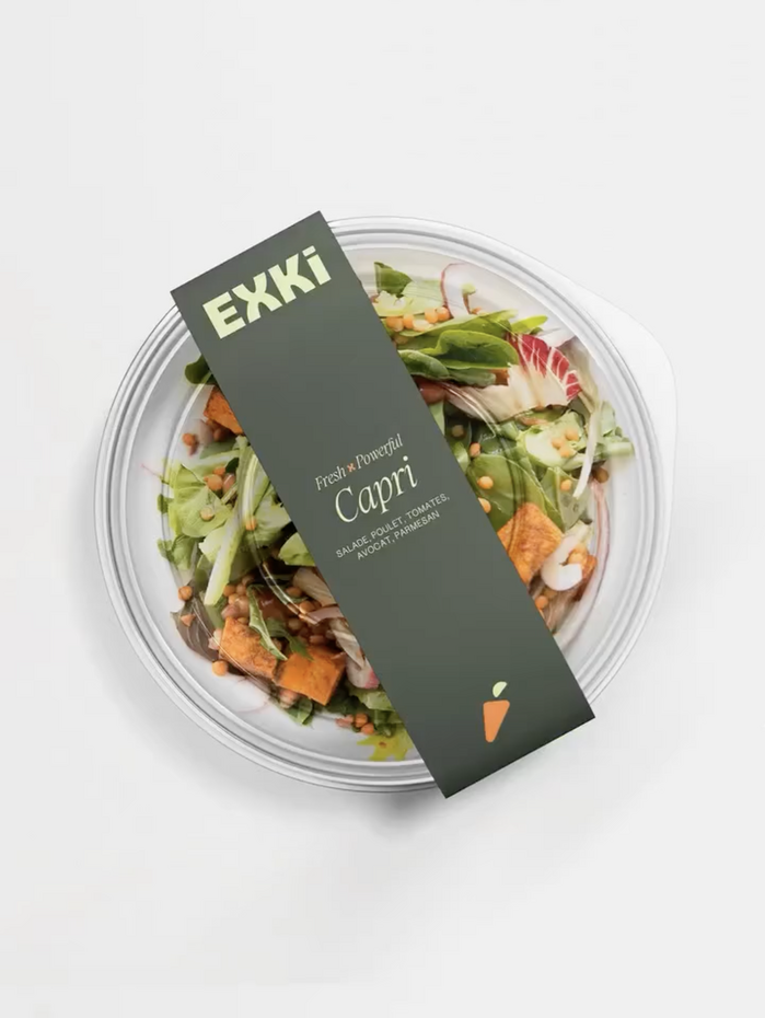
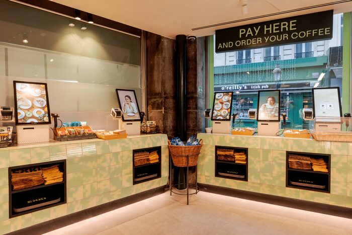
EXKi, a Belgian healthy food brand celebrating 25 years, recently revealed their global rebrand, led byAgathe MilletandImagina. At the heart of this new visual identity is a custom-drawn logo, which is bold, impactful, and clear, characterized by its rounded shapes. The brand’s iconic carrot has also been reworked; now geometric and rounded, it has become a symbol in its own right. The updated color palette has been reduced to three strong, contrasting colors, whileDiolce, the main font, balances and softens the design, withUncut SansandAnybodyused for additional information and communication. This comprehensive new visual identity extends across packagings, print and digital communication, the signage system, interior design, and a complete brandbook. See more from this rebrand on the websites ofAgathe MilletandImagina. Photo(s) by marcel van den berg grafisch ontwerp on Flickr.
This typography system communicates approachable wellness through geometric warmth. Diolce Display's rounded terminals and open apertures create a dynamic form model that feels crafted yet systematic, while the geometric elements prevent it from becoming too soft or childish. The combination establishes EXKi as premium-accessible—sophisticated enough for health-conscious urbanites but welcoming enough for everyday consumption.
Diolce Display serves as the perfect bridge between EXKi's heritage and modernization, with its dynamic form model featuring open apertures and rounded stress that echoes the reworked geometric carrot icon. The display font's moderate contrast and friendly terminals soften what could be clinical health messaging. Uncut Sans and Anybody provide rational counterpoints with their more closed apertures and vertical stress, creating informational hierarchy while maintaining the system's overall geometric harmony through shared circular construction principles.
This three-font system follows Kupferschmid's harmony principle by maintaining geometric underpinnings across all faces while varying contrast and personality. Diolce's dynamic warmth leads, while Uncut Sans and Anybody's more rational character handles functional text. The geometric DNA shared across all three fonts creates cohesion, while the contrast between Diolce's display flourishes and the supporting fonts' utilitarian nature provides clear hierarchical structure without jarring transitions.