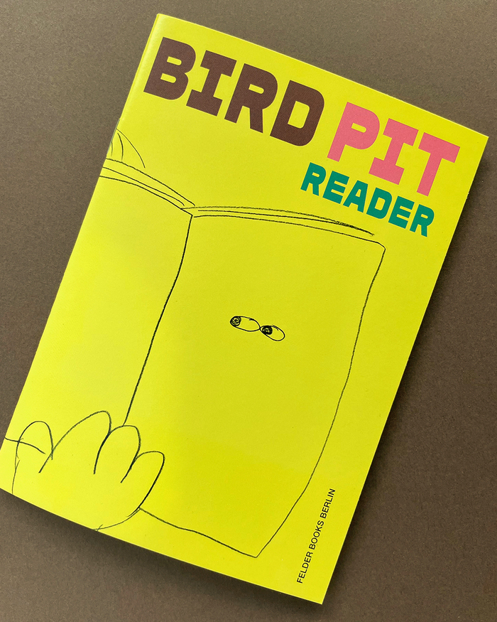
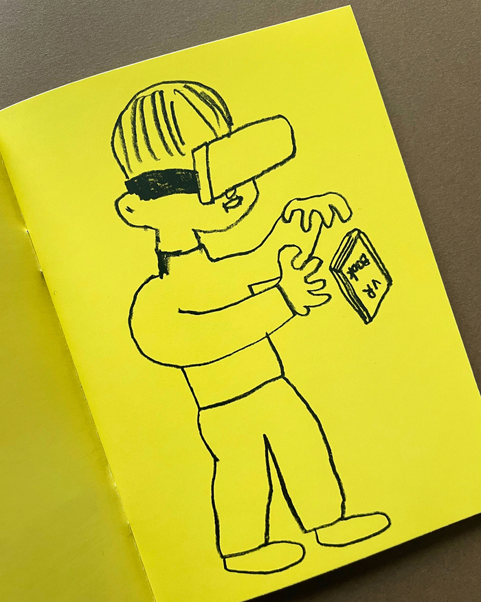
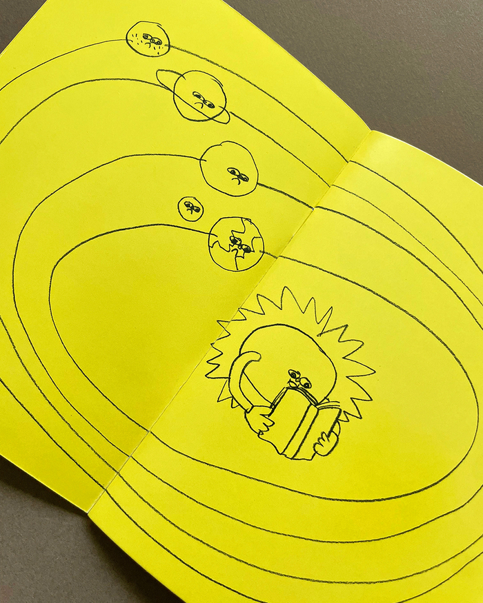
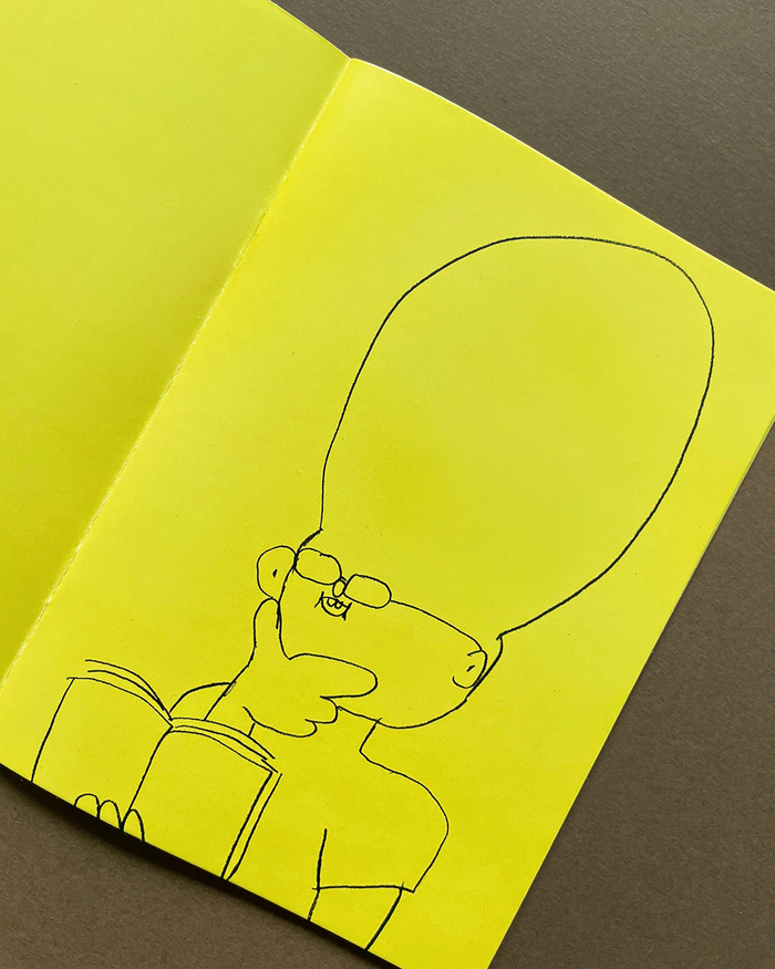
READERis a booklet of drawings from South Korean artistBird PitusingZiggyfromMA-MA Type.It was published byFelder Books Berlinin 2025: InREADER, Korean artist Seungwhan Kim (aka Bird Pit) uses his distinctive pencil style to show one thing above all: a book or a zine is a space full of possibilities. And as a “reader”, you’re right in the middle of it! The booklet measures 105×148.5 mm and spans 20 pages.
This typography communicates a playful, experimental energy that bridges Korean contemporary art culture with European independent publishing sensibilities. The Ziggy typeface creates an approachable yet sophisticated atmosphere that invites exploration and discovery, perfectly matching the "space full of possibilities" concept while maintaining editorial credibility for an art publication.
Ziggy's distinctive character set with its slightly condensed proportions and modern geometric foundation provides excellent readability at small booklet sizes while offering enough personality to complement Bird Pit's distinctive pencil drawing style. The font's balanced x-height and clean terminals ensure legibility across the alternating word colors, while its contemporary sensibility aligns with the forward-thinking approach of both the artist and Felder Books Berlin's curatorial vision.
As a single-font system, Ziggy's weight and style variations create clear typographic hierarchy throughout the 20-page booklet, allowing the distinctive letterforms to establish rhythm and pacing that complements rather than competes with Bird Pit's artwork. The font's inherent versatility enables it to function across cover, interior text, and display applications while maintaining visual cohesion.