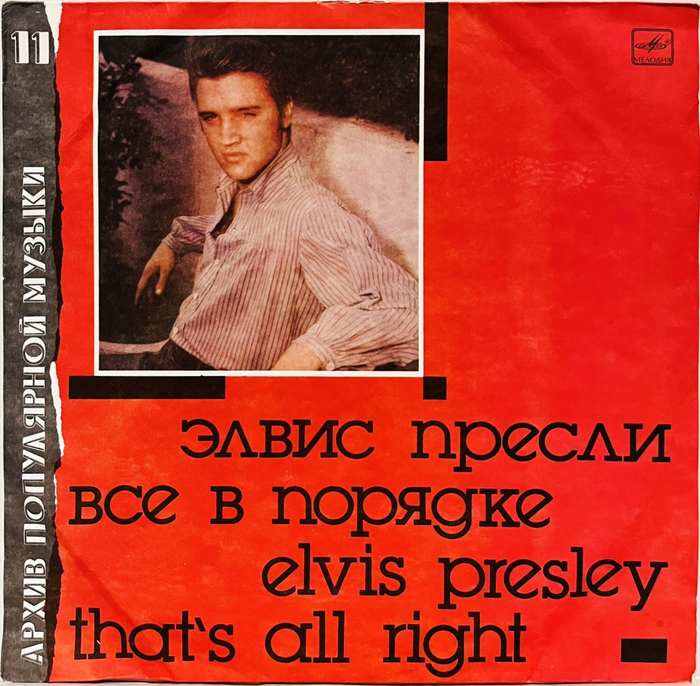
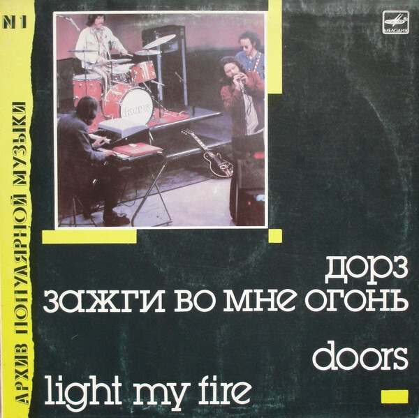
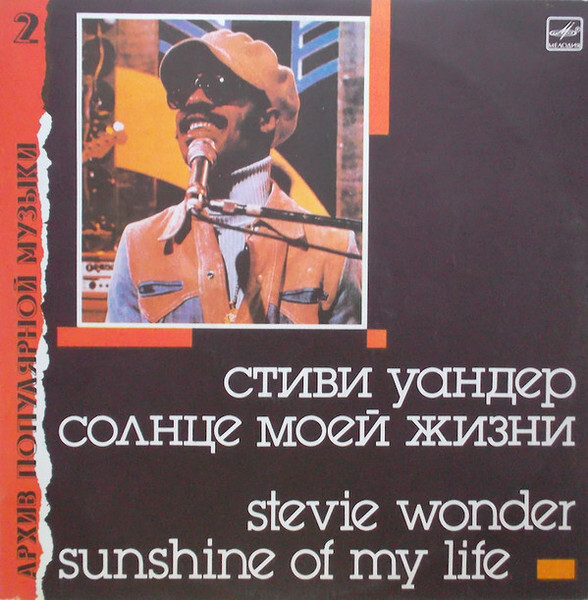
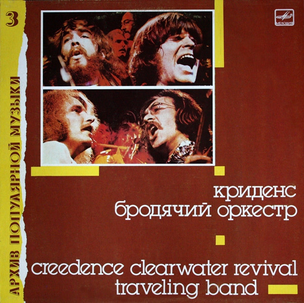
Архив Популярной Музыки(Arkhiv Populyarnoy Muzyki, English: Archive of Popular Music) was a series of twelve long-playing vinyl records issued by the Soviet state labelMelodiya(Мелодия) in 1988–1989. Each volume compiled key tracks from a single prominent figure in British and American pop and rock music of the 1950s to 1970s and included extensive liner notes detailing the artist’s creative history, a rarity in the USSR at the time. This made the series a significant window into Western music culture for Soviet listeners, who otherwise had very limited access to such information. The cover art and visual identity of the series were created by designerAndrey Gusev, whose work unified the releases and distinguished them from both original Western album artwork and earlier Soviet compilations like the three-LPRock Archiveline from 1987, which used the same music and text but different covers. The series occupied a complex space in Soviet practice: although it carried a higher retail price framed as a “foreign license” premium, the recordings were sourced from private collections and pre-1973 masters under a legal regime that did not require international royalties, leading some contemporary historians to describe the releases as bootleg-like products of their era. For a more detailed history of the series, see Artur Netsvetaev’sarticle for Soviet Rock. For the bilingual typography, Gusev usedITC Lubalin Graphin all-lowercase letters. The series title and number are added inHelion.
This typography communicates intellectual accessibility with underground credibility—the all-lowercase ITC Lubalin Graph suggests democratic, non-hierarchical access to Western culture while maintaining scholarly gravitas through its geometric structure. The bilingual presentation creates a bridge between Soviet formality and Western pop culture casualness.
ITC Lubalin Graph's tight letter spacing and geometric construction provides institutional authority needed for an archival series, while its all-lowercase treatment democratizes the content and reduces Western cultural intimidation. The font's sturdy slab serifs ground the design in print tradition, essential for a series positioning itself as definitive documentation rather than entertainment product.
The pairing creates clear informational hierarchy—Lubalin Graph's distinctive personality handles the cultural translation work while Helion's neutrality allows series numbering to recede appropriately. This prevents competing voices in what needed to feel like authoritative curation rather than flashy marketing.