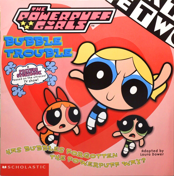
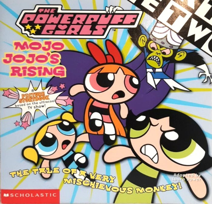
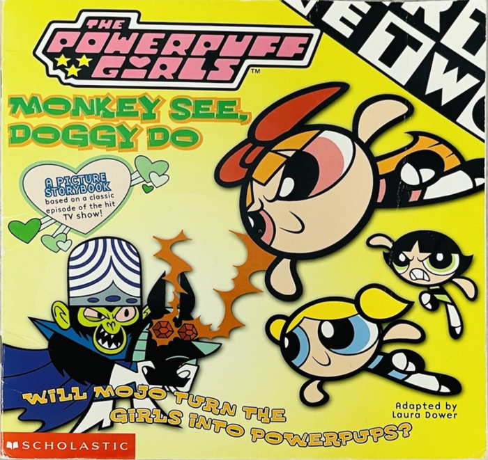
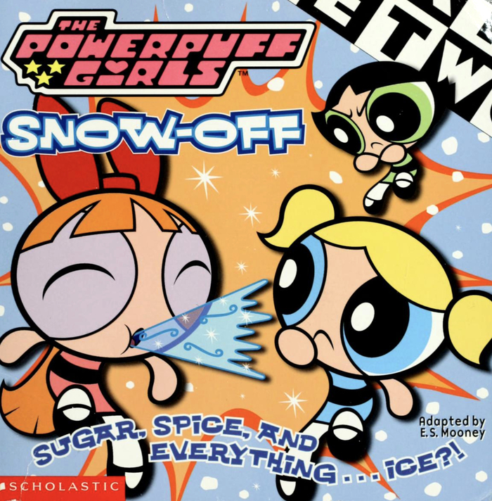
Bubble Troubleby Laura Dower, May 2000. Cover design by Peter Kobish. Around 2000,Scholasticpublished a series of picture story books adapted fromCartoon Network’sPowerpuff Girls. The main typeface on the covers (and, for some books, also on interior pages) isWhachouse. Designed in 1993 as part of House Industries’General Collection,Ken Barber’s bold wide semi-slab appears to be inspired by faces likeBenguiat Interlock. A decade later, in 2004, House Industries would collaborate withEd Benguiaton a more advanced interpretation of a similar design,Ed Interlock. Whachouse is typically used with one or more colored contours, and a curved setting of the subtitle. All smaller text is inZuzana Licko’sBase 9 Sans. ThePowerpuff Girlslogo is custom drawn and doesn’t use a font. There at least two fonts based on it, though:Powerpuff Girlsby Tom White and Powerpuff byNeale DavidsonofPixel Sagas(2011–2014, revised in 2015 and renamedUtonium). The Cartoon Network logo that’s partly visible in the top right corner usesEagle,see the dedicated post. Mojo Jojo’s Risingby Laura Dower, April 2000. Cover design by Peter Kobish. Monkey See Doggy Doby Laura Dower, October 2000. Cover design by Peter Kobish. Snow-Offby E.S. Mooney, December 2000. Design by Louise Bova. Fishy Businessby Laura Dower, 2001. Cover by Christopher Cook, design by Louise Bova. The Mane Eventby Alice Jablonsky, 2002. Cover by Bill Alger, design by Bethany Dixon. Let the Fur Flyby Laura Dower, 2002. Cover by Carlo Lo Raso, design by Peter Kobish.
Whachouse delivers exuberant, superhero-inspired energy through its bold, wide semi-slab construction with geometric underpinnings and high impact letterforms. The typeface's inflated proportions and sturdy serifs create a sense of cartoonish power and accessibility—serious enough to suggest superhero authority but playful enough for young readers. When paired with colored outlines and curved baselines, it transforms from merely bold to genuinely kinetic, embodying the show's blend of girl-power heroism and sugary sweetness.
Whachouse operates from a geometric form model with constructed letterforms that echo the show's simplified, animation-friendly aesthetic. Its wide proportions and semi-slab serifs provide the necessary impact for small-format book covers while maintaining legibility at distance. The chunky stroke weight and open counters ensure the type reads clearly when layered with colored outlines—a treatment that would destroy more delicate typefaces. Base 9 Sans serves as the rational counterpoint with its closed apertures and vertical stress, providing clean hierarchy without competing for attention.
This pairing follows sound structural principles by contrasting geometric display impact with rational sans utility. Whachouse's constructed, wide proportions play against Base 9's more conventional rational model, creating deliberate tension that mirrors the show's superhero-meets-kindergarten concept. Both fonts share sufficient weight and clarity to work within the series' colorful, high-contrast visual environment, with Base 9's restrained personality allowing Whachouse to dominate the hierarchy without typographic chaos.