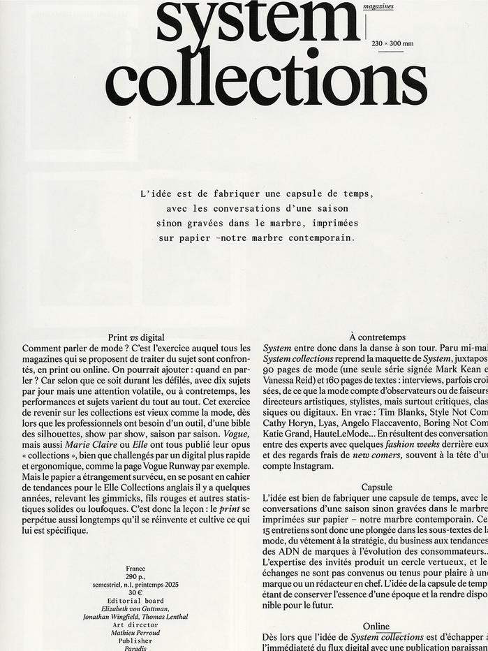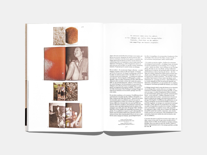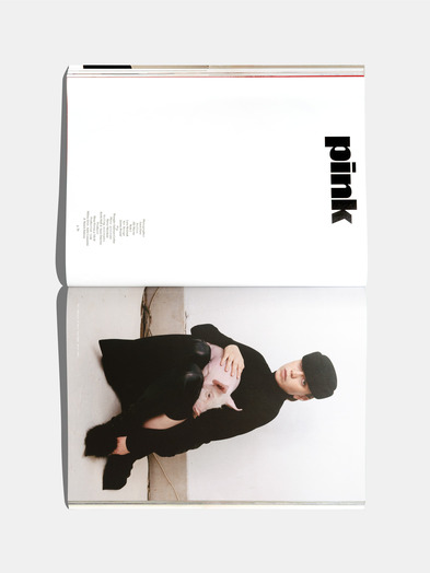


In 2025,eschenlauer sinicwas appointed Associate Art Directors ofMagazinemagazine, an iconic publication that has shaped the creative landscape since the late 1990s. Founded by Angelo Cirimele together with Yorgo Tloupas and Alexandre Thumerelle (0fr.), the magazine has long stood as a cult reference in independent publishing. Today, under Cirimele’s direction, it continues to embody freedom of tone and a spirit of experimentation. Published twice a year for eachParis Fashion Week, every issue combines two sections: a fashion section, entrusted to an invited figure from the industry (photographer, model, or stylist) who creates a dedicated visual story with their creative circle, and a press section, composed of commissioned essays that examine how fashion is seen, written, and mediated. The graphic direction takes its cue from Jan Tschichold’s manifesto for a new typography, where form is treated as a critical stance. At its core lies the typefaceStore Norske Leif, designed as a synthesis of twentieth-century press typography. Drawing on reinterpretations ofTimes,Lifeand other editorial classics, it distills their features into a contemporary standard. Without capitals, with restrained punctuation and precise proportions, Leif acts both as a tool for thought and as a structural framework, a reinvented archetype of fashion type. The layout follows a flexible modular grid: photographs extend edge to edge in frontal compositions that echo screen logic, monospace headlines introduce subtle irregularities that animate the page, and isolated pull quotes punctuate the white space with silent rhythm. For issue 44 (FW25), the logotype was composed inPolka, chosen for its singular resonance with the fashion section. With each issue, the titles of the magazine and of the fashion section are reinterpreted in dialogue with the invited contributor’s universe, while Leif remains the typographic constant of the publication. Through this typographic and editorial system,Magazine Magazinereaffirms its unique position, a space where fashion is both written and seen, and where typography becomes a language of critique.
This typography communicates intellectual rebellion with editorial authority—a kind of scholarly punk aesthetic that challenges typographic conventions while maintaining serious credibility. The all-lowercase Store Norske Leif creates an anti-hierarchical, democratic voice that feels both experimental and historically grounded, embodying the magazine's position as a critical fashion publication that operates outside mainstream commercial pressures.
Store Norske Leif works brilliantly for this context because its synthesis of 20th-century press typography (Times, Life) provides editorial gravitas while its lack of capitals and restrained punctuation creates a deliberately subversive, lowercase-only voice that feels contemporary and anti-establishment. The monospace variant introduces calculated irregularities that animate layouts without sacrificing readability, while Polka's playful contrast for section titles creates dynamic tension against Leif's serious, scholarly baseline.
The Leif/Leif Mono/Polka system creates sophisticated hierarchical tension—Leif provides the serious editorial foundation with its scholarly press heritage, the monospace variant adds rhythmic irregularity and digital-age texture, while Polka injects moments of typographic surprise and fashion-world playfulness. This creates a publication voice that's simultaneously critical and creative, academic yet experimental.