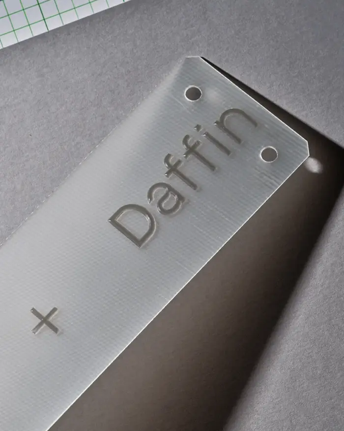
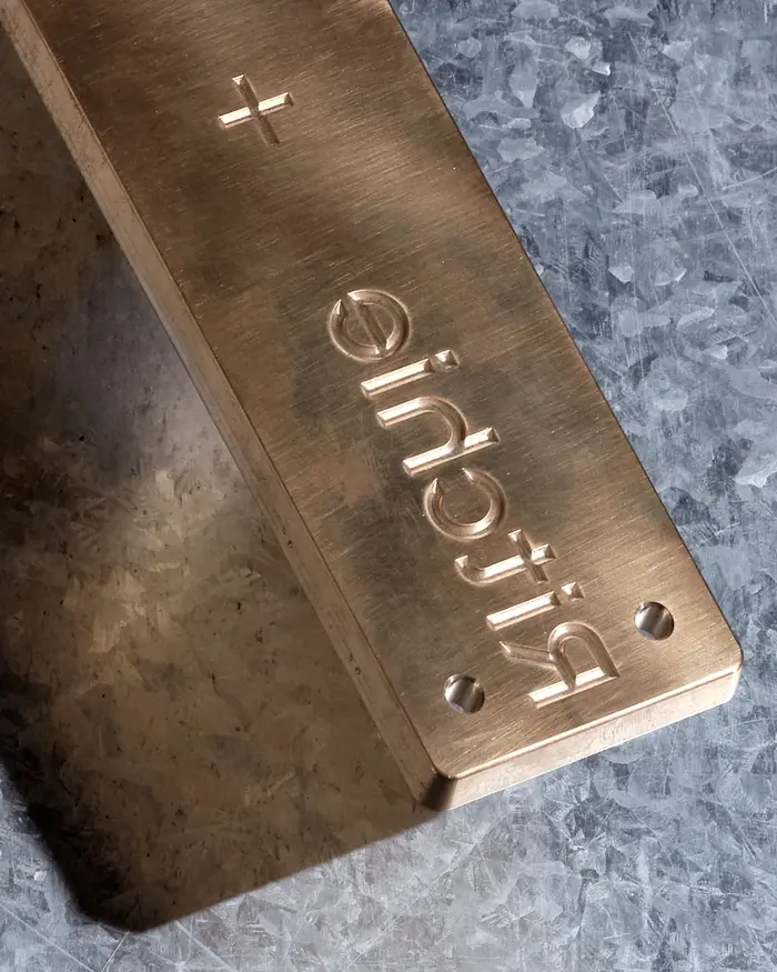
Details from recent rebrand for engineering design practiceRitchie+Daffin.BitumbyBrownfoxin used in Regular and Italic across all materials.
Bitum communicates a distinctly technical-humanist energy that balances engineering precision with approachable craftsmanship. The typeface's sturdy, workmanlike character suggests methodical problem-solving and reliable expertise, while its subtle warmth prevents it from feeling cold or impersonal. This creates a brand personality that says "serious engineering capability delivered by people who care about details."
Bitum's robust letterforms with generous x-height and balanced stroke weight make it highly legible across digital applications while conveying structural integrity—essential for an engineering practice's credibility. The typeface's subtle industrial references in its letter construction echo architectural drawing conventions, while its Regular/Italic pairing provides clear hierarchy without sacrificing cohesion. The slightly condensed proportions work efficiently in data-heavy contexts like project tables and specifications.
Using Bitum Regular and Italic creates internal typographic hierarchy through style variation rather than contrasting typefaces, maintaining visual consistency while enabling clear information organization. The Regular weight establishes authoritative body text and headers, while the Italic provides emphasis and secondary information differentiation. This restrained approach reflects engineering discipline—functional differentiation without unnecessary complexity.