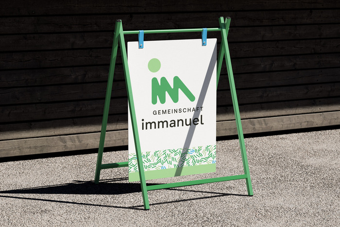
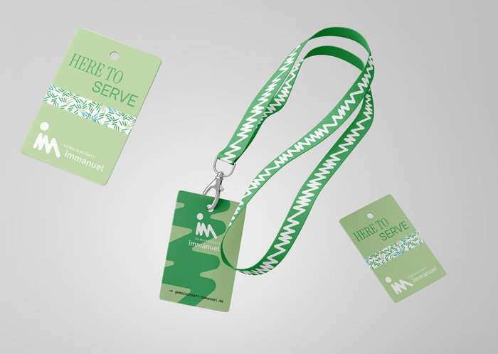
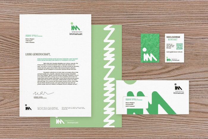
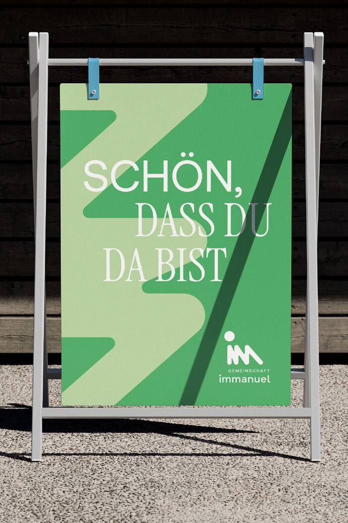
This project involves a complete redesign ofGemeinschaft Immanuel e.V.– a Catholic community in Germany. The logo is based on the letters “iMM” and the idea that, if we focus on the things that unify rather than divide us, we move closer together. From this concept and the values of the community, the overall design language was developed. Rather than relying solely on photography, typography plays a vital role in the design language.Aeonikis used as the default font, combined with the condensed and softInstrument Serif. It is complemented by the monospacedJetBrains Monoon informational details, an intentional touch that simplifies the modification of dates and times. Contributed by Frode Helland (Monokrom Skriftforlag)
This typography system creates a distinctive spiritual-modernist energy that bridges institutional gravitas with approachable humanity. Aeonik's rational form model—with its closed apertures and vertical stress—provides contemporary authority without cold corporatism, while Instrument Serif's condensed proportions and soft terminals inject warmth and intimacy. The combination communicates "progressive tradition"—a Catholic community that honors heritage while embracing contemporary connection.
The pairing strategically balances institutional credibility with pastoral warmth through complementary rational forms. Aeonik's closed apertures and systematic proportions establish contemporary religious authority, while Instrument Serif's condensed width and softer stroke terminals create approachable intimacy for personal messaging. JetBrains Mono serves a functional role for dates/times but also reinforces the system's contemporary digital-first positioning, suggesting a community comfortable with technology and transparent communication.
This is a textbook example of contrast-with-cohesion pairing: both primary fonts share a rational form model with vertical stress and controlled apertures, creating structural harmony, while differentiating through serif treatment and proportion. Aeonik provides the systematic clarity of a contemporary grotesk, while Instrument Serif's condensed forms and bracketed serifs add textural warmth without compromising the shared vertical authority. The monospace serves as functional punctuation rather than typographic disruption.