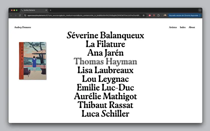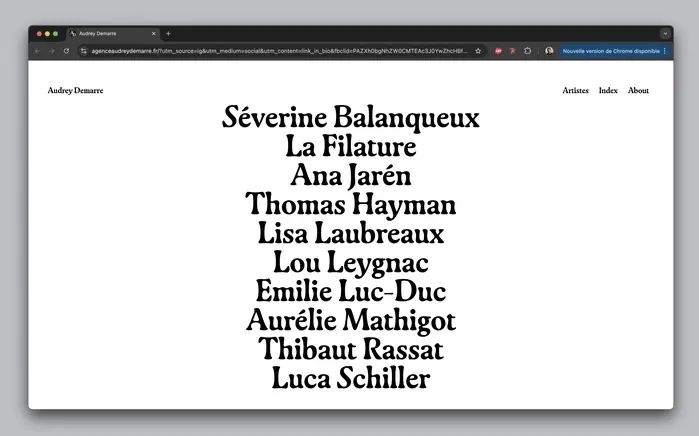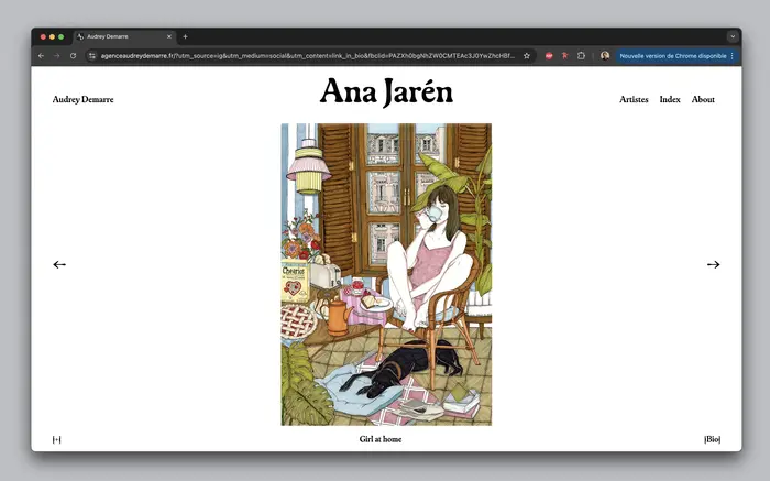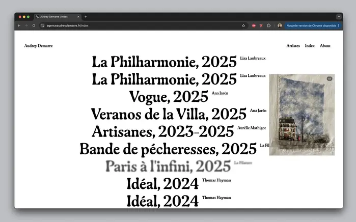


Gayain use for the visual identity and website of the artist agentAudrey Demarre. The identity is based on a unique typeface, conceived as a link between different artistic worlds. Design byMaison SolidewithLisa Manus. Code byÉlie Quintard.
This typography communicates artistic sophistication with understated confidence—the kind of refined modernism that bridges high culture and contemporary accessibility. The Gaya typeface creates an intellectual warmth that suggests curatorial expertise without pretension, positioning the agency as a discerning connector between artistic worlds rather than a flashy self-promoter.
Gaya's humanist characteristics—its moderate contrast, open counters, and subtle calligraphic influence—make it ideal for a cultural intermediary brand. The typeface's versatility across weights and its strong italic performance support the multilingual requirements while maintaining typographic cohesion. Its contemporary serif design bridges traditional cultural authority with modern digital fluency, essential for an agent operating across artistic disciplines.
As a single-family system, Gaya creates hierarchy through its well-developed weight and style range, with the italics providing expressive contrast for emphasis and movement. The typeface's inherent flexibility allows it to shift from authoritative body text to expressive display usage, creating visual rhythm without sacrificing brand consistency across the multilingual interface.