Tangible Design Festivalpresents its event as follows (translated by the contributor): Tangible is a festival dedicated to all forms of design expression, offering a close look at local specificities. Supported by several partner organizations/designers from the Aix–Marseille–Provence metropolitan area and coordinated by the Fotokino association, it is conceived as a shared program promoting the visibility, promotion, and dissemination of design practices in the region. Each year, a call for participation invites organizations and professionals to propose and organize events that will enrich the program. Open to all forms of expression (object design, graphic design, urban design, textile design, social design, crafts, etc.), the festival draws on the vitality of the local context while exploring links with related practices: research, crafts, art, and applied arts.
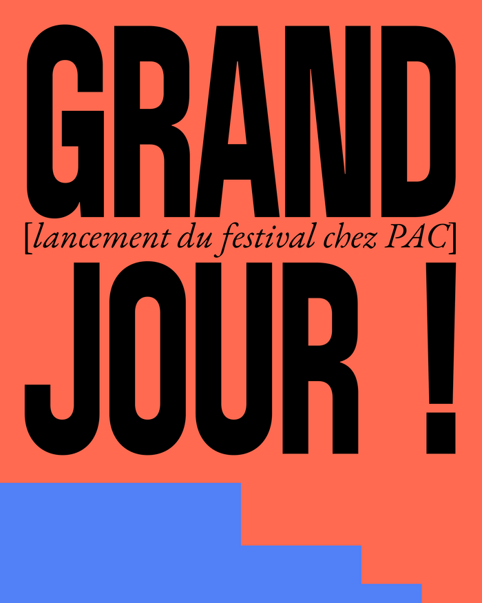
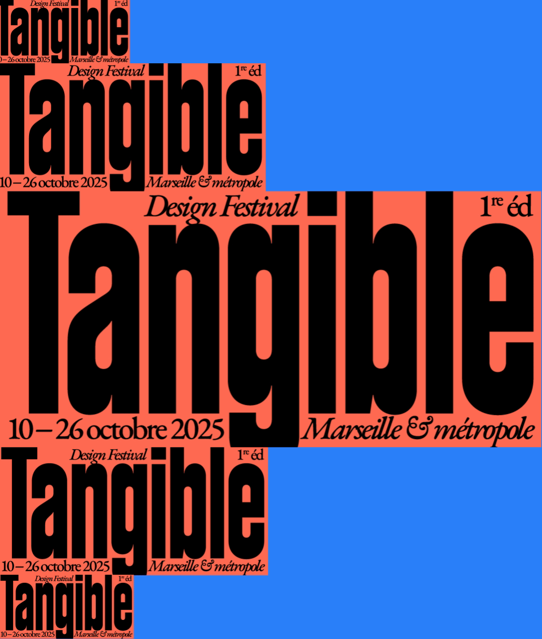
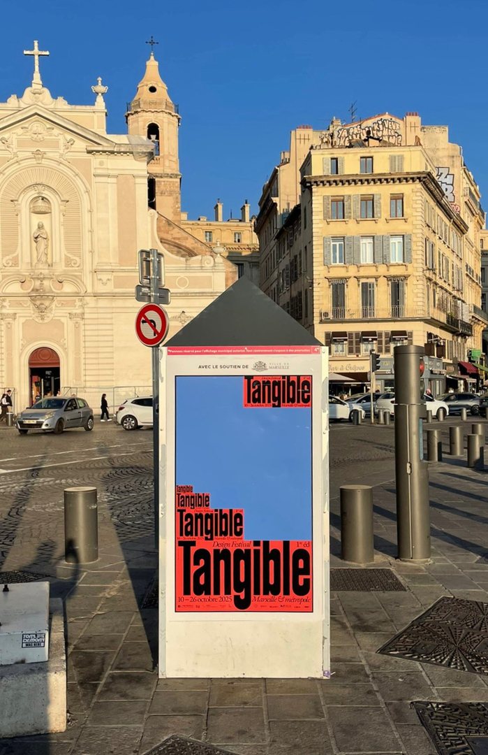
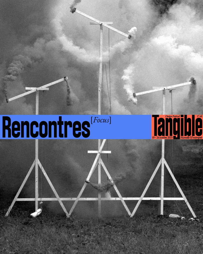
AC Bandit's dynamic form model with open apertures and calligraphic warmth creates an approachable, creative energy that positions the festival as inclusive and community-driven rather than elitist. Paired with EB Garamond's scholarly gravitas, the typography communicates cultural sophistication grounded in accessibility—perfect for a regional festival that bridges academic design discourse with local creative practices.
AC Bandit brings dynamic letterforms with open counters and friendly terminals that counterbalance the potential stuffiness of design academia, while EB Garamond's moderate contrast and readable proportions provide editorial credibility without intimidation. The pairing leverages contrast-with-cohesion: both fonts share humanist DNA but express it differently—Bandit through contemporary sans-serif warmth, Garamond through classical serif authority—creating a hierarchy that feels both credible and welcoming.
This pairing follows sound structural logic by combining fonts from the dynamic form model category but with different surface treatments. AC Bandit's open apertures and friendly terminals share the humanist warmth of EB Garamond's old-style forms, creating harmony through shared calligraphic roots. The contrast between sans and serif creates clear functional hierarchy while maintaining tonal consistency—both fonts feel approachable rather than cold or geometric.