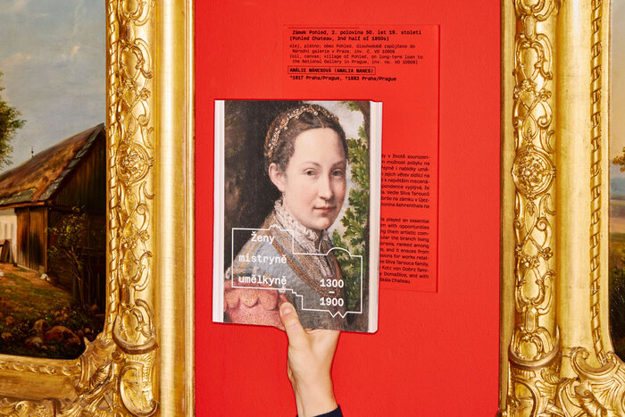

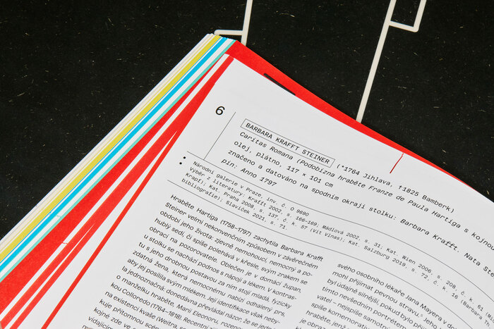
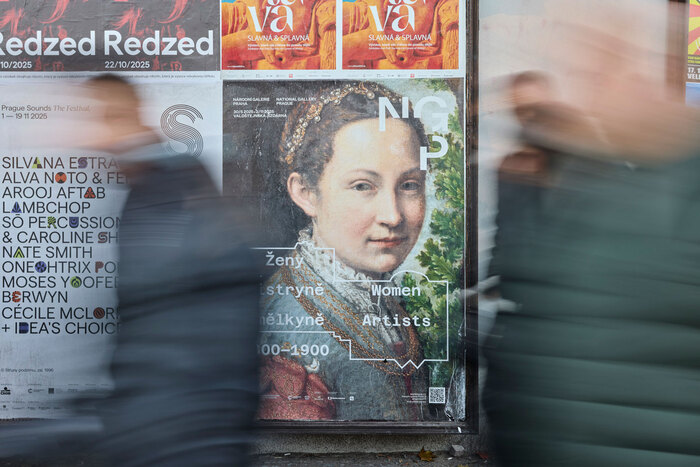
TheNational Gallery Praguedecided to present artworks the origins of which are linked to women and cover a lengthy period of six hundred years – from the fourteenth century to the beginning of the twentieth. Through this exhibition, the National Gallery Prague intends to fill a gap in terms of what may hitherto have been overlooked or is incomplete from the visitor’s point of view. Two of the gallery’s collection exhibitions, housed in the Schwarzenberg and Sternberg Palaces at Hradčany, are named Old Masters (I–II). But this very title linguistically excludes women from the creative process, or at least hides them beneath a generic masculine term. This is also the reason why the stylised sketches of the floor plans of both palaces appear in the graphic presentation, in the architectural design of the exhibition, and on the cover of the exhibition catalogue, thereby drawing attention to the marginalised role of women in the aforementioned installations The visual identity, exhibition graphics, printed matter and exhbition catalogue usedAzeretandAzeret Monofamily typeface byDisplaay Type Foundry.
Azeret's geometric construction with softened edges creates an intellectual warmth that bridges institutional authority with contemporary accessibility. The typeface's moderate contrast and open apertures prevent the coldness typical of purely rational forms, while its geometric DNA maintains the scholarly gravitas essential for a national gallery. This dual nature—serious yet approachable—perfectly embodies the exhibition's mission to make overlooked women artists visible without sacrificing academic credibility.
Azeret's geometric form model with rational influences serves the dual audience of scholars and general visitors through its systematic construction and humanist warmth. The typeface's moderate x-height and open counters ensure excellent legibility across multilingual content (Czech/English), while its geometric consistency creates visual cohesion across diverse exhibition materials. The proportional/monospace pairing leverages structural similarity—both sharing geometric DNA—while the mono variant provides necessary differentiation for captions, dates, and archival information without disrupting the overall typographic voice.
The Azeret/Azeret Mono pairing exemplifies perfect structural harmony through shared geometric form model while creating functional differentiation. Both typefaces maintain identical letterform proportions and geometric construction, ensuring visual cohesion across exhibition materials. The monospace variant serves archival and technical information needs—crucial for art historical documentation—while maintaining the family's accessible geometric character. This approach creates hierarchy through spacing rather than contrasting form models, reflecting the exhibition's theme of revealing hidden connections.