

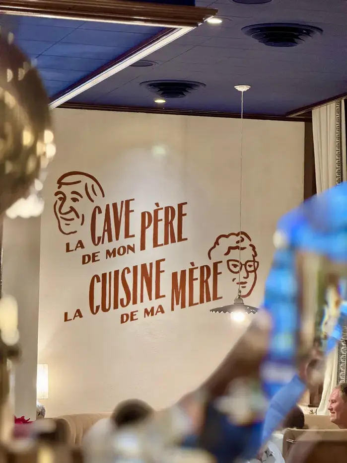

A new sign forLe Bouchon Alsacien, the restaurant run by Jacky and Fred, new owners of the former Cazenove in Lyon’s 6th district. The exterior now features a glass gilding panel combining engraving and gold leaf gilding (manufactured byGiusto Manetti Battiloro). The deep blue background highlights a swirl of shimmering letters, creating a classic and luminous result that pays tribute to Lyon’s and Alsace’s heritage. Inside, a lime fresco bears the owners’ tribute phrase, “the cellar of my father, the dishes of my mother” alongside other hand-painted elements that extend the artisanal touch throughout the space. The typefaces in use areAlbuquerquebyOrnamental & Title Type,LHF Thick and Thin SansbyThomas KennedyofLetterhead Fonts,Gandur NewbyBlackletra, andDrafterbyDouble Dagger.
This typography system evokes artisanal French heritage through deliberate eclecticism that mirrors traditional sign-painting practices. The mix of display faces—from Albuquerque's Western-influenced letterforms to Gandur New's blackletter references—creates a curated antiquarian energy that feels authentic rather than nostalgic pastiche. The varied form models (dynamic script elements, rational sans structure, geometric blackletter construction) work together like a traditional sign painter's toolkit, suggesting craftsmanship over corporate consistency.
The multi-font approach mirrors historical French signage where artisans selected letterforms for specific communicative functions rather than brand consistency. Albuquerque's dynamic forms with open apertures provide warmth for the main identity, while LHF Thick and Thin Sans offers rational clarity for secondary information. Gandur New's blackletter references connect to Alsatian Germanic heritage, and Drafter's constructed forms provide contemporary grounding. The varied contrast levels and stress axes create visual hierarchy through typographic voice rather than mere size differentiation.
This isn't traditional font pairing but rather a typographic palette approach—each face serves a distinct communicative role like colors in a painter's toolkit. The fonts deliberately span different form models (dynamic, rational, geometric) creating contrast through structural difference rather than surface styling. This mirrors traditional French signage where letterers chose forms for function, creating cohesion through craft quality and spatial arrangement rather than typographic harmony.