
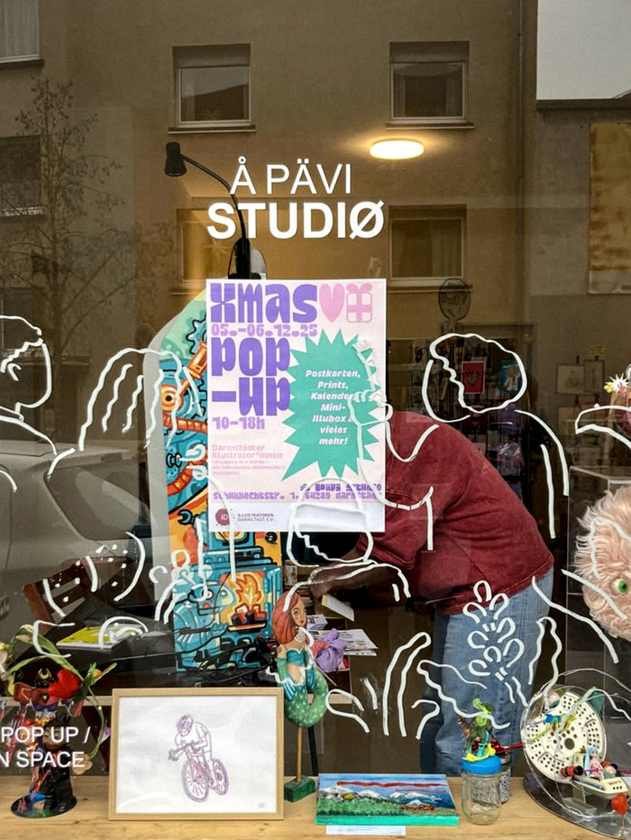
Darmstadt-based designerMary Vũdesigned a poster for a local Christmas pop-up market at theÅ Pävi concept store. She usedDina Chaumont DisplayandDina Chaumont Textto create a poster that is visually striking. The bright colours reinforce the visual impact of the message.
Exuberant holiday celebration with sophisticated European design sensibility. The Dina Chaumont family brings a refined yet playful energy that feels both festive and elevated, avoiding the typical commercial Christmas clichés. The bright color palette amplifies the typeface's inherent warmth while maintaining typographic credibility.
Dina Chaumont's distinctive personality comes from its subtle humanist characteristics and versatile weight range, making it perfect for creating hierarchical interest without font mixing. The display variant provides impact for headlines while the text version ensures readability in smaller applications. Its moderate contrast and friendly terminals communicate approachability while avoiding the saccharine quality of typical Christmas typography.
Using optical sizes from the same family (Display and Text) creates sophisticated typographic unity while providing functional hierarchy. The display cut offers more dramatic presence for attention-grabbing headlines, while the text variant maintains legibility at smaller sizes. This approach demonstrates typographic sophistication while keeping the visual system cohesive and purposeful.