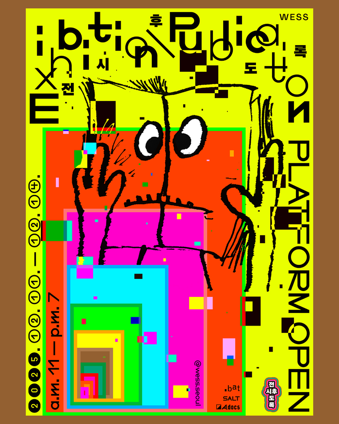
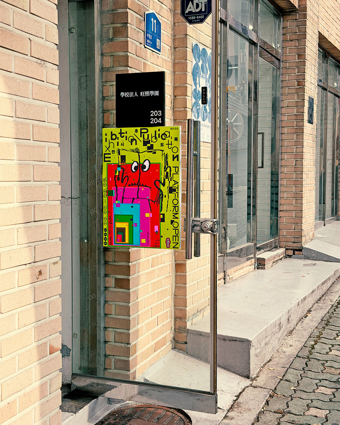

WESS Exhibition \ Publication 2025explores how exhibition experiences can be recorded and revisited through publications that remain after an exhibition ends. While exhibitions are often temporary and fleeting, publications continue to circulate across different times and places, generating new contexts. This project focuses on the lasting nature of publications and the time that unfolds beyond the exhibition itself. In this design,Everyday Practicevisualizes the layered and multifaceted character of exhibition publications. By juxtaposing different formats, colors, and textures, the design brings together exhibition, publication, and record as an intertwined state. A friendly character looking at a book serves as a central element, making the potentially heavy subject of exhibition publications more approachable. Rather than defining a clear hierarchy, the design allows multiple perspectives to coexist, suggesting the open-ended possibilities of publications after the exhibition. The creative direction and design is byJoonho Kwon. They usedNeue Sammlungfor English text andAG Superblack Gothicfor Korean.
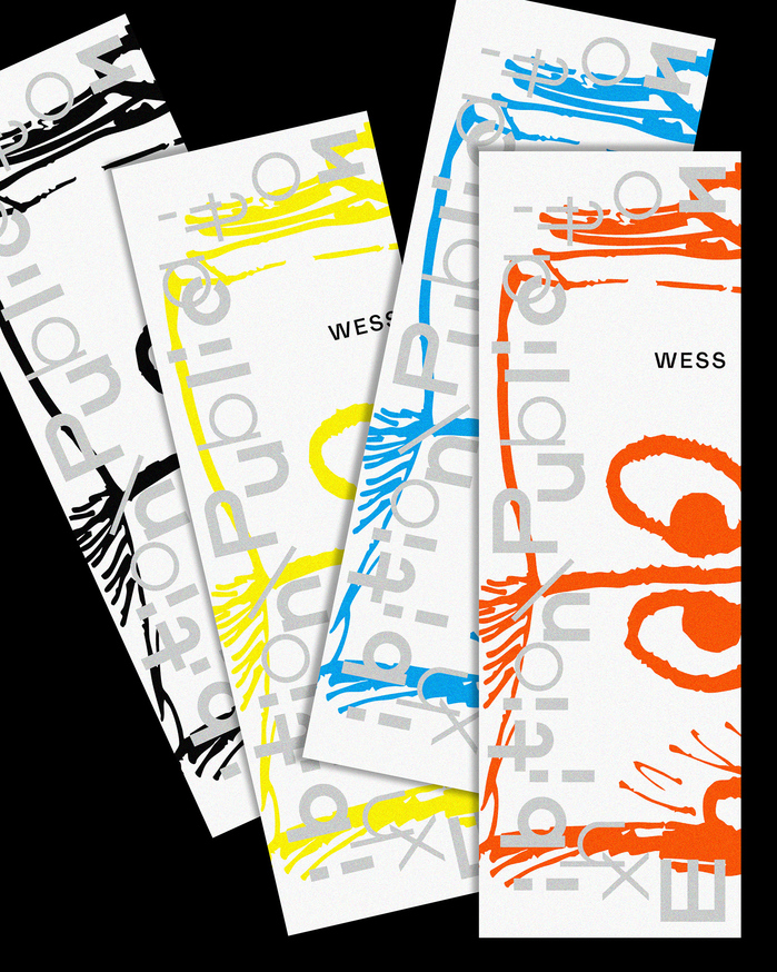
The typography creates an intellectual playground where academic rigor meets experimental curiosity. AG Superblack Gothic's brutal density and condensed proportions generate institutional weight while maintaining accessibility, while Neue Sammlung's rational clarity provides breathing room and editorial sophistication. This creates a brand energy of "approachable scholarship" — serious enough for academic discourse but playful enough to invite broader engagement with complex curatorial concepts.
AG Superblack Gothic's extreme weight and condensed structure serves as a visual anchor that mirrors the density of archival content, while its Gothic skeleton retains enough warmth to avoid institutional coldness. Neue Sammlung's rational form model — with its closed apertures and vertical stress — provides editorial authority for English text while maintaining optical compatibility through shared condensed proportions. The weight contrast between the fonts creates hierarchy not through size but through typographic density, reflecting the project's theme of layered temporal experiences.
This pairing operates on contrast-with-structural-cohesion: both fonts share condensed proportions and institutional DNA but diverge dramatically in weight and cultural expression. The Gothic's extreme density against Sammlung's rational clarity creates deliberate tension that mirrors the bilingual nature of the content. Rather than following Kupferschmid's form model harmony, this pairing uses weight and cultural specificity as differentiators while maintaining proportional compatibility that prevents visual chaos.