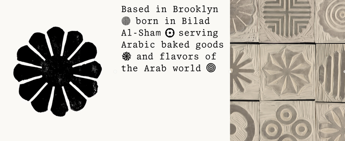
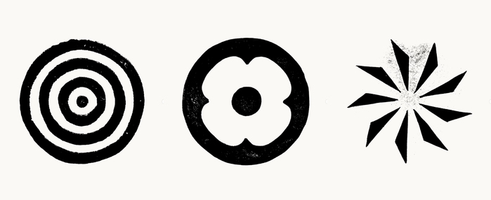
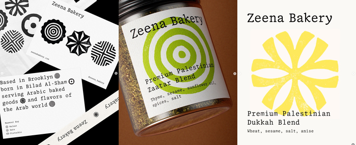
Zeena Bakery’s visual identity, designed byPortrait, uses00 Wagram Mono SlabbyD0UBLE ZER0 Foundrythroughout. The typeface appears across the logo, packaging, printed materials, and the website, providing a consistent typographic system. Based in Brooklyn, born in Bilad Al-Sham, serving Arabic baked goods and flavors of the Arab world. 00 Wagram Mono Slab is part of the 00 Wagram Collection, a serif family influenced by late-1990s and early-2000s office typefaces, as well as historical models such as Monotype Plantin. The collection is built around a neutral base that extends into more varied styles.The identity is complemented by handmade linocut ornaments, which introduce texture and contrast alongside the controlled typographic framework.
00 Wagram Mono Slab communicates a refined editorial authority grounded in craft authenticity. The slab serif's uniform character widths create systematic precision while its warm, slightly condensed proportions and soft terminals prevent corporate coldness. This typeface channels the gravitas of traditional publishing with contemporary restraint, embodying the confidence of a neighborhood institution that honors its cultural heritage without performative nostalgia.
The monospaced slab serif operates from a rational form model with closed apertures and vertical stress, establishing institutional credibility essential for a food business crossing cultural boundaries. However, its slab terminals and generous x-height introduce warmth that prevents the coldness typical of rational grotesks. The uniform character width creates rhythmic consistency across Arabic and Latin scripts, while the moderate contrast level ensures legibility across packaging scales and digital environments without losing personality.
As a single-font system, 00 Wagram Mono Slab creates hierarchy through weight variations within its rational structural DNA. The monospace foundation provides systematic cohesion while different weights (likely regular, medium, bold) generate visual contrast without introducing competing structural logics. This approach mirrors editorial design principles where a single well-chosen typeface family handles all typographic needs, reinforcing brand consistency while the handmade linocut ornaments provide necessary textural counterpoint.