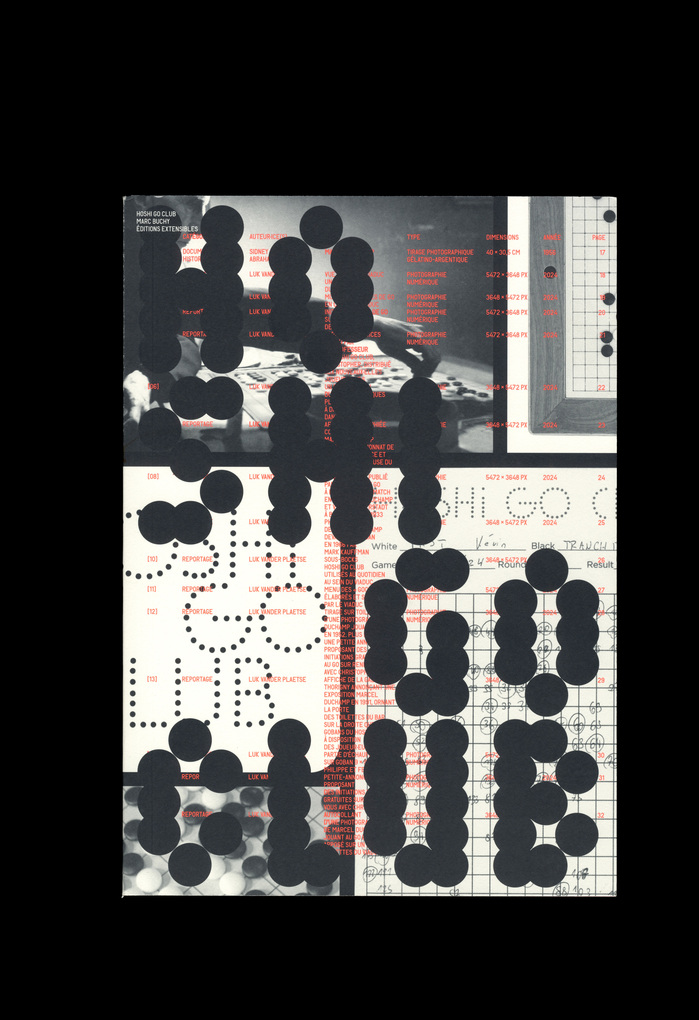
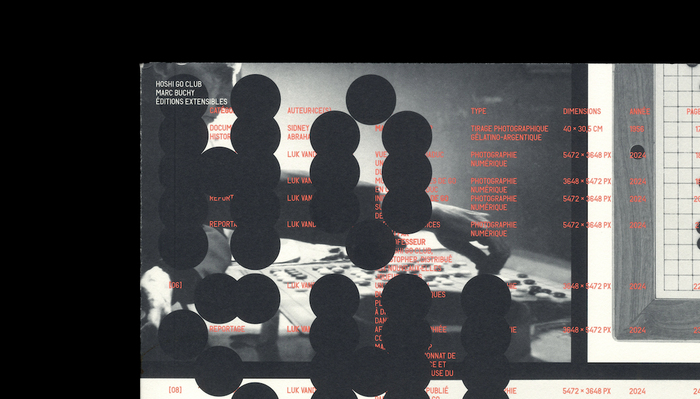
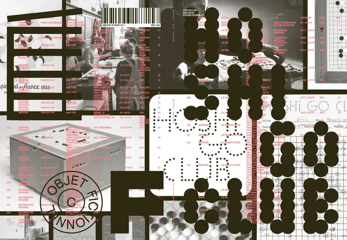
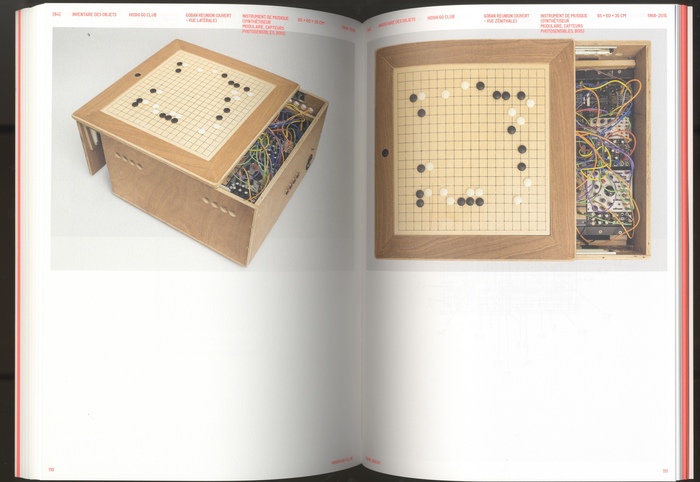
What if Duchamp had playedGoinstead of chess? This speculative idea, developed byMarc Buchy, is the starting point for a project that unfolds across art, fiction, and social space – from an intervention in a Brussels bar (co-produced by Botanique and Komplot, autumn 2024) to this newly published book byLes Éditions Extensibles. As described byMarc BuchyinArt Même, the work opens a “zone of grey art” – a real bar hosting a fake-yet-real Go club under the imagined memory of the Go player Marcel Duchamp never was. A true space for sociability, play, exchange, and learning – all central themes in Buchy’s practice. The book measures 21×29.7 cm, spans 144 pages, and was printed in a limited edition of 500 copies. It was designed byAtelier Choque Le Goff, usingTiny,Tor grotesk, andLL Bradford. It’s not clear if the smaller letters made of dots are from a typeface or custom made.
This typography creates a cerebral-playful energy that bridges high art conceptualism with accessible game culture. The combination communicates intellectual sophistication without pretension, embodying Duchamp's spirit of turning serious art into conceptual play. The dot-matrix elements and varied typographic weights suggest both the strategic precision of Go and the experimental nature of readymade art.
Tiny's condensed geometric forms provide editorial efficiency perfect for dense art book content, while Tor Grotesk's Swiss neutrality grounds the conceptual material without competing. LL Bradford's classical proportions add literary gravitas befitting a philosophical art project. The dot-matrix typography literally visualizes Go stones while referencing early computer aesthetics, creating a bridge between ancient game strategy and contemporary digital culture.
This three-font system creates sophisticated informational hierarchy through contrasting personalities rather than just weight variation. The geometric precision of Tiny contrasts beautifully with Bradford's humanist warmth, while Tor Grotesk serves as the neutral mediator. The custom dot elements add a fourth typographic voice that's both decorative and conceptually integral to the Go theme.