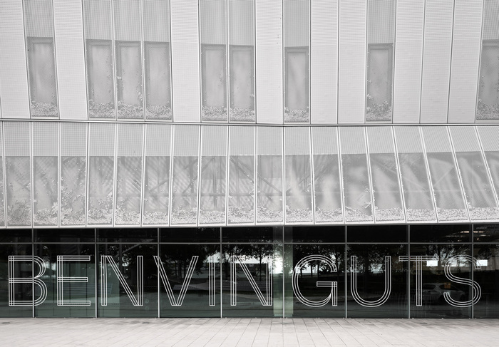
Milling
Milling follows a geometric form model with constructed circular forms and systematic letter spacing, built on uniform stroke weights and vertical stress patterns. The typeface exhibits closed apertures and tightly controlled counter shapes, creating a rational, orderly presence on the page. Its heritage lies in the geometric sans tradition established by Futura and Avenir, but Milling appears to push toward more condensed proportions and tighter letter spacing than its predecessors. The lack of italics and limited weight options suggests this is positioned as a display-focused geometric, designed for impact rather than extended reading. It excels in headlines and branding applications where its systematic construction creates authority and modernity, but the tight spacing and geometric rigidity would likely create uneven typographic color in body text applications.