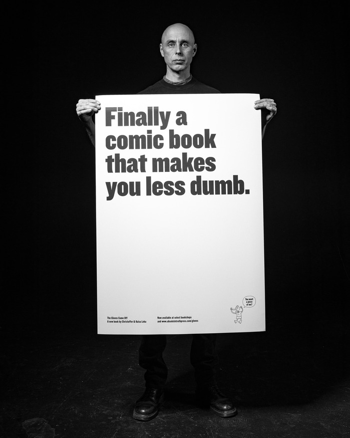
Trade Gothic
Trade Gothic represents the rational form model with its vertical stress, closed apertures, and systematic construction logic that prioritizes order over warmth. The contrast is nearly absent, creating uniform stroke weights that reinforce its industrial, no-nonsense character. Counters are deliberately compact, and the x-height sits high relative to cap height, creating dense typographic color that commands attention but sacrifices easy readability at small sizes. This is Jackson Burke's 1948 interpretation of American gothic sensibilities — more condensed and aggressive than European neo-grotesques like Helvetica, with a distinctly pragmatic personality that emerged from mid-century commercial typography needs. Trade Gothic excels as a headline workhorse where its compressed proportions and authoritative voice cut through visual noise, but its tight spacing and closed forms make it unsuitable for extended reading. It brings a utilitarian confidence to any page — serious, compressed, and unapologetically functional.