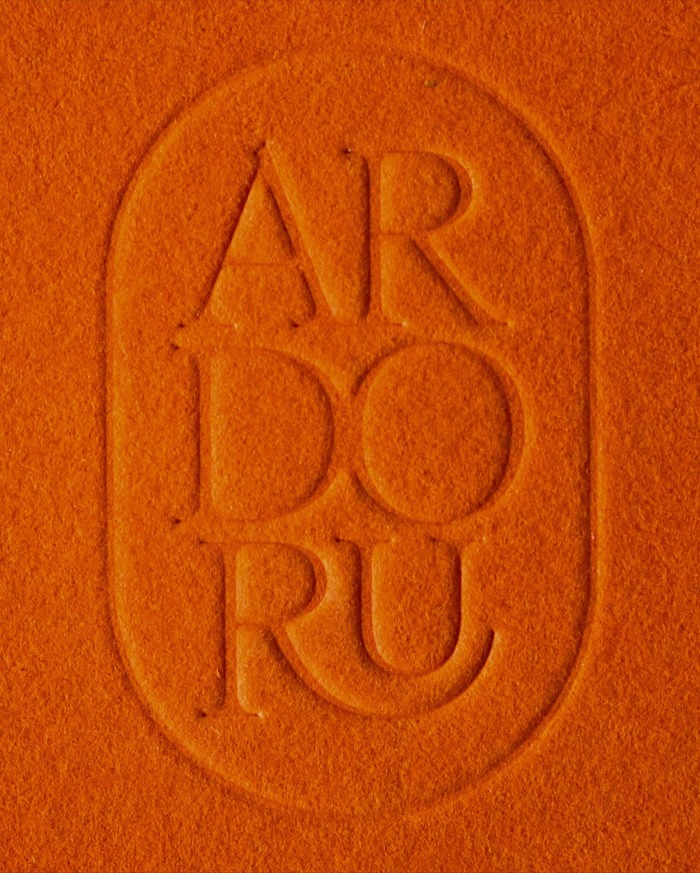
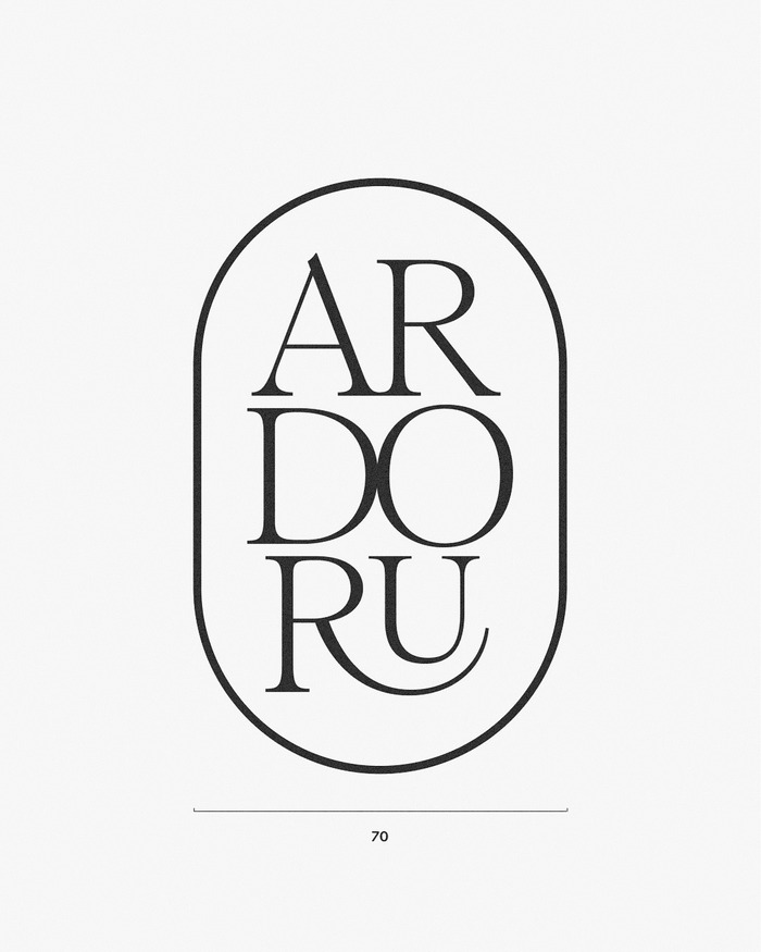
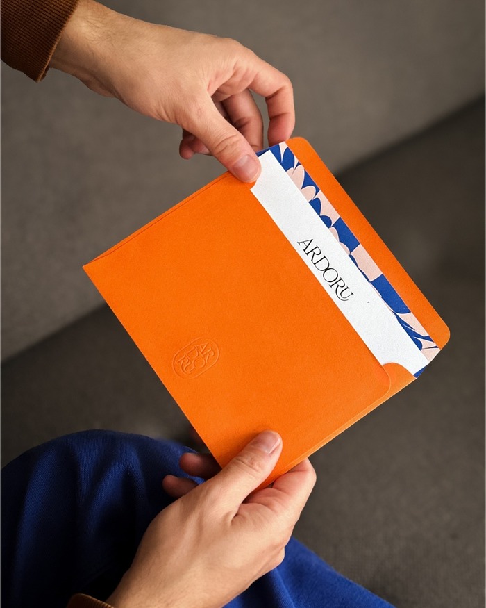

ArdorUoffers a service for sending greeting cards with “your words, handwritten and mailed in minutes.” The brand is defined by poised, elegant serifs, refined ligatures, and a tactile signet, paired with a precise and unforgettable orange. The bright envelope ensures instant brand recognition the moment it arrives. The visual identity designed by Vienna-based studioSRtranslates this sensibility through soft ligatures, graceful serifs, and an embossed signet that echoes the craftsmanship of handwritten correspondence. The logo is set inRomie RegularbyMargot Lévêque. The typefaces used on the website areABC Arizona SansbyElias Hanzerfor text andRauschen BbyPhilipp Herrmannfor headings.
ArdorU's typography communicates sophisticated intimacy through the interplay of Romie's high-contrast editorial serifs and Arizona Sans's rational precision. The serif carries dynamic warmth with its open apertures and calligraphic details, while the sans provides structured clarity with tight letterforms and vertical stress. This creates a brand energy that feels both artisanal and digitally native—handcrafted expertise delivered through contemporary systems.
Romie's transitional character brings editorial authority softened by dynamic apertures and refined details, perfectly suited for a brand bridging analog craftsmanship with digital convenience. Arizona Sans provides rational counterpoint with its closed forms and systematic construction, ensuring digital legibility while maintaining typographic sophistication. The pairing creates functional hierarchy where the serif establishes premium positioning while the sans handles interface clarity—essential for a service translating personal sentiment into physical delivery.
This is a textbook contrast-with-cohesion pairing following Kupferschmid's mixed-model approach. Romie (dynamic/transitional) and Arizona Sans (rational/grotesk) operate from different structural foundations but share similar x-height proportions and vertical emphasis. The high-contrast serif establishes emotional resonance while the low-contrast sans provides digital functionality. Rauschen B likely serves as display typography, adding a third voice that bridges the serif's warmth with contemporary edge.