
Romie operates from a geometric skeleton with perfectly circular counters and systematic construction, yet it softens the rigid modernist template through subtle optical corrections and warm detailing. The letterforms show clear geometric DNA—the 'o' is nearly circular, the 'a' has a simple bowl construction, and the 't' carries a straightforward crossbar—but Grilli Type has introduced just enough humanist inflection to prevent the sterility that plagues pure geometric sans serifs. The apertures in letters like 'c' and 'e' open generously, creating breathing room that enhances readability while maintaining the face's clean, systematic character. This is geometric modernism with a contemporary conscience—it retains the authoritative precision of faces like Futura but trades cold perfection for approachable functionality. Romie excels in digital environments where clarity and personality must coexist, though its single-weight limitation relegates it primarily to display and headline applications where its geometric confidence can shine without the burden of extended reading.
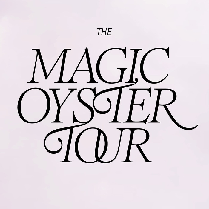
The Magic Oyster Tour
This typography creates a sophisticated bohemian energy that balances artisanal craft with editorial polish. Romie's dynamic form model—with open apertures, organic stroke modulation, and distinctive swashes—channels the spontaneous, handmade quality of pop-up culture, while GT America Condensed's rational vertical stress and tight letterforms provide structural discipline. Together they communicate curated eclecticism: refined enough for design-conscious audiences but playful enough to feel approachable and experimental.
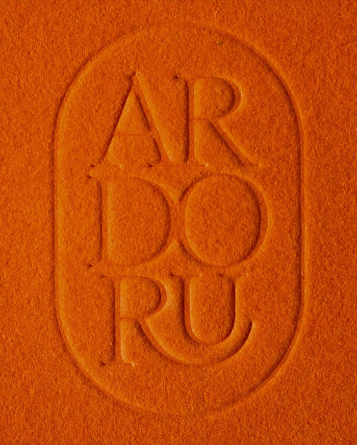
ArdorU
ArdorU's typography communicates sophisticated intimacy through the interplay of Romie's high-contrast editorial serifs and Arizona Sans's rational precision. The serif carries dynamic warmth with its open apertures and calligraphic details, while the sans provides structured clarity with tight letterforms and vertical stress. This creates a brand energy that feels both artisanal and digitally native—handcrafted expertise delivered through contemporary systems.