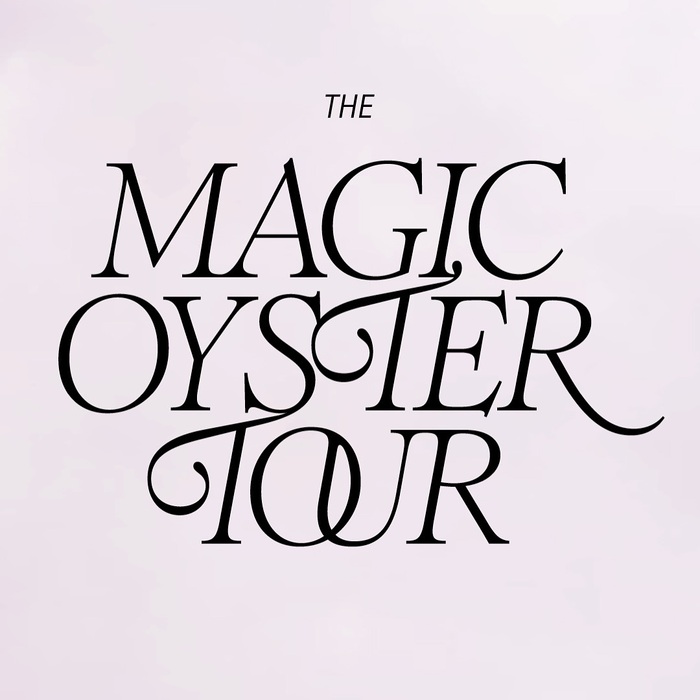
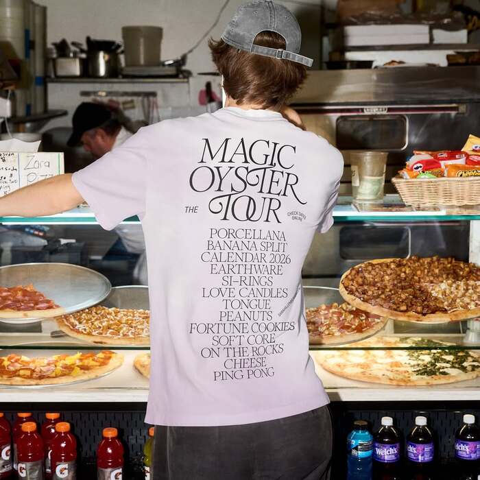
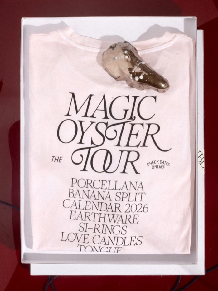
The Magic Oyster Touris a series of pop-up events across Germany, organized bySara Hillenberger. It presents objects, calendars, ceramics, new shirts, live acts, and much more. The design was created byHerburg Weiland, usingRomieRegular and Italic (designed byMargot Lévêque), and available fromClaude Type Foundry. Romie is supported byGrilli Type’sGT AmericaCondensed.
This typography creates a sophisticated bohemian energy that balances artisanal craft with editorial polish. Romie's dynamic form model—with open apertures, organic stroke modulation, and distinctive swashes—channels the spontaneous, handmade quality of pop-up culture, while GT America Condensed's rational vertical stress and tight letterforms provide structural discipline. Together they communicate curated eclecticism: refined enough for design-conscious audiences but playful enough to feel approachable and experimental.
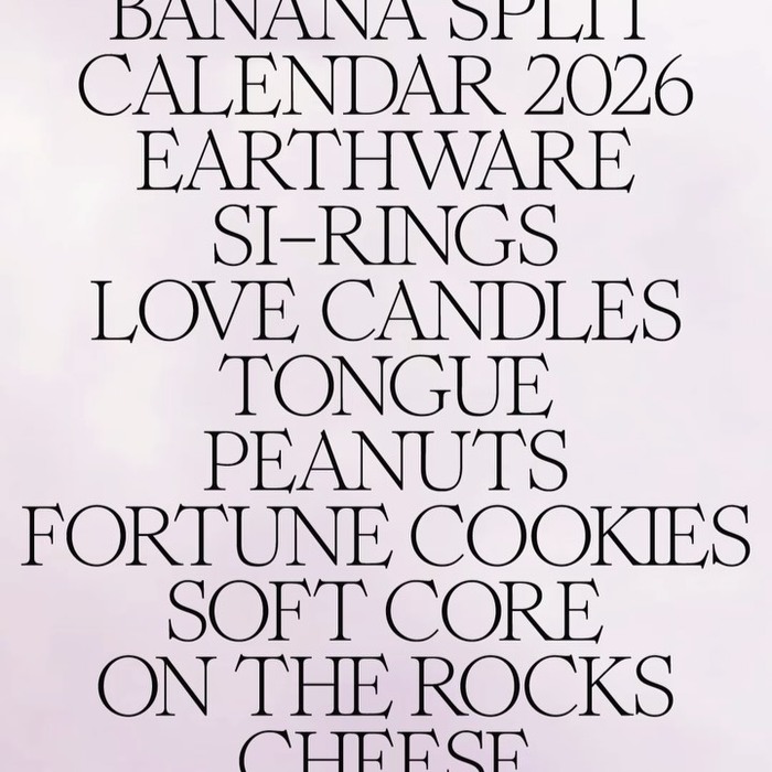
Romie's dynamic form model serves the nomadic, artisanal nature of pop-up events perfectly—its calligraphic DNA and contextual ligatures mirror the handcrafted objects being showcased, while the italic's forward momentum literally embodies "tour" energy. GT America Condensed provides essential contrast through its rational form model: closed apertures and vertical stress create typographic authority for information hierarchy, while the condensed width maximizes space efficiency across merchandise and social formats. The pairing works because both fonts share mid-level contrast, creating surface cohesion despite their different structural approaches.
This pairing follows Kupferschmid's contrast-with-cohesion principle expertly. Romie (dynamic) and GT America (rational) represent different form models but share similar contrast levels and x-height proportions, creating structural compatibility. The deliberate tension between Romie's organic warmth and GT America's mechanical precision mirrors the Magic Oyster Tour's positioning—artisanal objects presented with curatorial sophistication. The condensed width of the supporting sans maximizes the expressive space for Romie's flourishes while maintaining legibility in constrained formats.