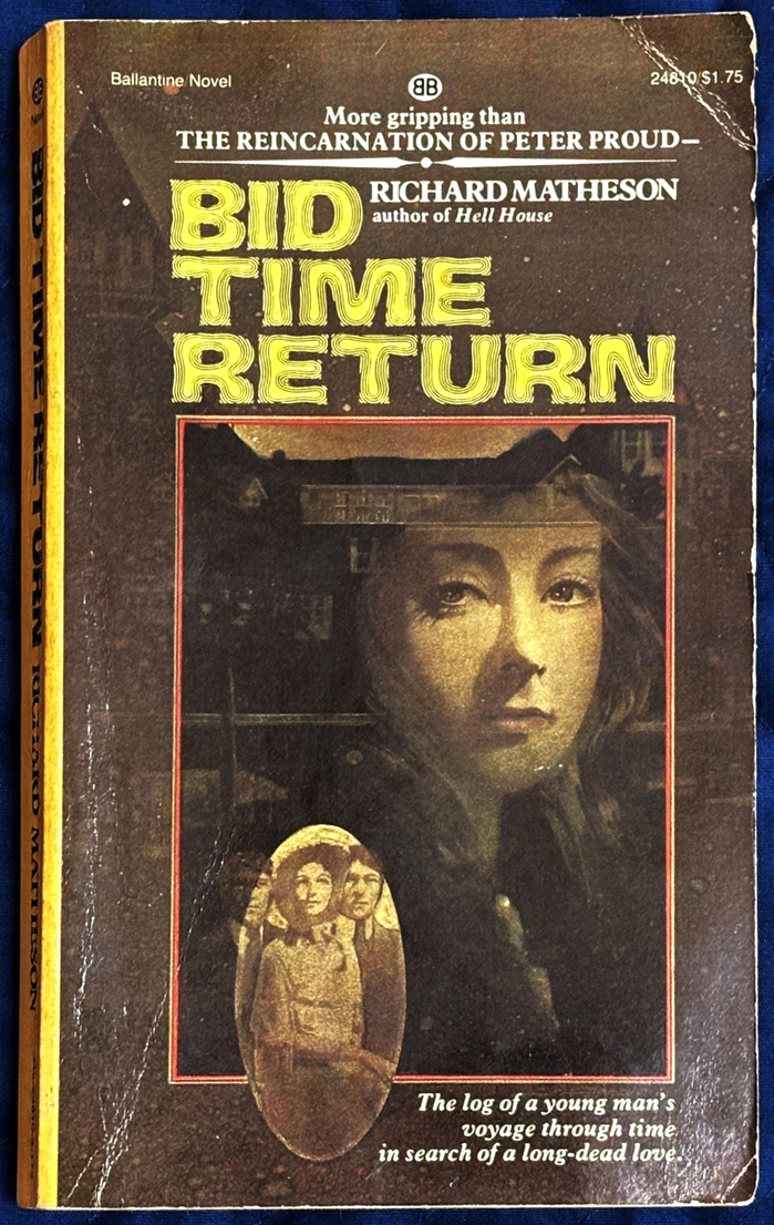
Bid Time Returnis a 1975science fictionnovel by American authorRichard Matheson. It concerns a man from the 1970s whotravels back in timeto court a 19th-century stage actress whose photograph has captivated him. In 1980, it was made into the filmSomewhere in Time, the title of which was used for subsequent editions of the book. First published in February 1975 by Viking Press (withITC Grouchfor the title), this is Ballantine’s paperback edition from 1976. It featuresJohn S. Allen’s elusiveRiptide.
Allen's Riptide creates a distinctly cinematic sci-fi energy through its dramatically flared letterforms and expansive character spacing, evoking 1970s genre poster typography with theatrical flair. The wide stance and organic curves suggest dynamic movement through time itself, while Plantin's transitional authority grounds the author's literary credibility. Together they balance pulp genre excitement with established publishing gravitas.
Riptide's dynamic form model with open apertures and flowing stress creates the perfect vehicle for time-travel romance, its theatrical letterforms echoing both Victorian stage drama and 1970s cinematic poster typography. The wide character spacing amplifies the font's inherent drama while maintaining legibility at small spine sizes. Plantin's rational structure and moderate contrast provide necessary typographic hierarchy without competing with Riptide's personality, their pairing creating clear information architecture across cover elements.
This pairing follows contrast-through-opposition principles: Riptide's highly dynamic, display-oriented personality against Plantin's restrained rational authority. While they occupy different form models, both share moderate stroke contrast that prevents jarring visual conflict. The dramatic difference in character width and stance creates clear hierarchical distinction while the shared contrast level maintains visual cohesion across the cover system.