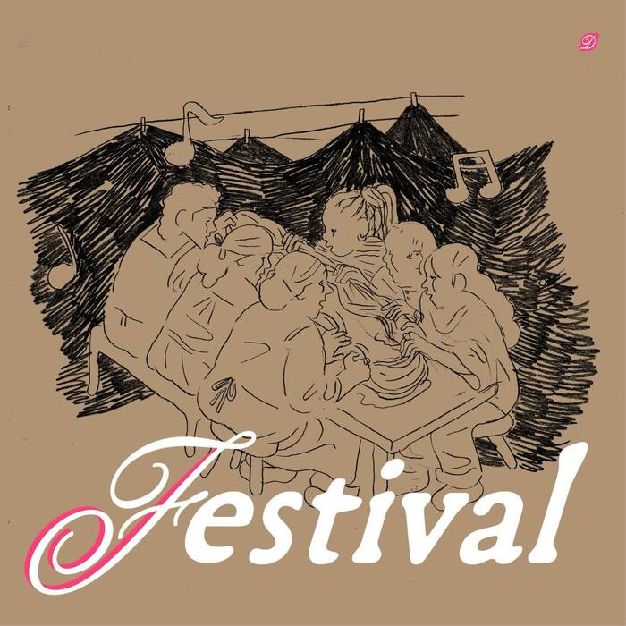
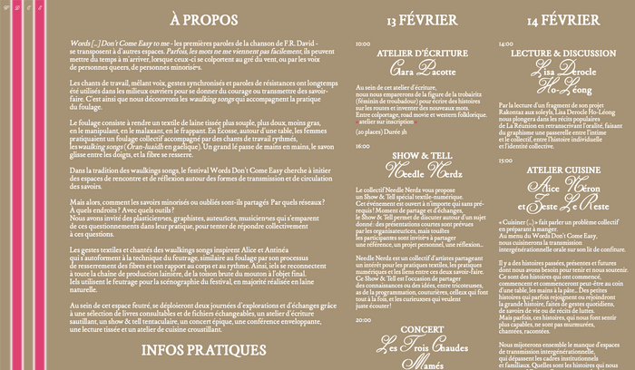
In the tradition ofWaulking songs, theWords Don’t Come Easy Festivalseeks to create spaces for encounter and reflection on the forms of knowledge transmission and circulation. “Words […] Don’t Come Easy to me” – the opening lyrics ofF.R. David’s song– resonate with other contexts. Sometimes, words don’t come easily to me; they can take time to reach me, when they are carried on the wind, or by the voices of queer people, of minority groups. Work songs, blending voices, synchronized gestures, and words of resistance, have long been used in working-class communities to bolster courage or pass on skills. This is how we discover the Waulking songs that accompany the practice of fulling. Within this cozy space, two days of exploration and exchange will unfold thanks to a selection of books to consult and files to exchange, a lively writing workshop, a sprawling show & tell, an epic concert, an enveloping conference, a woven reading and a crispy cooking workshop. An event organized byAlice Laurichessein collaboration withLucie Bouchet,Antinéa Chaponand Marcus Malinvaud. The typography usesGarabosse Mignon·neandPerle, with initials fromCordier Script.
The typography communicates intellectual warmth with a distinctly French literary sensibility—sophisticated yet approachable. The Garabosse family's dynamic form model, with its open apertures and subtle calligraphic warmth, creates an intimate scholarly atmosphere that invites contemplation. Cordier Script's decorative initials add ceremonial gravitas, positioning this as a curated cultural experience rather than casual entertainment.
Garabosse represents a masterful choice for literary discourse, with its dynamic form model offering the warmth needed for community-building while maintaining scholarly credibility through refined proportions and moderate contrast. The pairing of Mignon·ne and Perle within the same type family creates sophisticated hierarchy through optical size variations rather than jarring weight jumps. Cordier Script's flourished capitals provide punctuation and ceremony, honoring the tradition of illuminated manuscripts while grounding the festival in European literary heritage.
This is exemplary same-family pairing that demonstrates understanding of optical sizing principles. Garabosse Mignon·ne and Perle share identical structural DNA—same dynamic stress, apertures, and proportional relationships—while being optically tuned for different reading contexts. Cordier Script creates deliberate textural contrast through its ornamental nature, but the shared calligraphic heritage maintains cohesion. This approach avoids the common trap of arbitrary weight mixing, instead using the designer's intended optical relationships.