
Cordier Script
Cordier Script follows the dynamic form model with its flowing, calligraphic construction rooted in handwritten letterforms, though its decorative flourishes push it firmly into display territory. The typeface exhibits moderate contrast between thick and thin strokes, maintaining the natural variation of pen-drawn letters while avoiding the extreme modulation that would make it fragile at smaller sizes. Its open apertures and connected letterforms create the characteristic rhythm of formal script writing, with ascending and descending strokes that demand generous line spacing. This is a heritage script that draws from 18th-century copperplate traditions, offering the warmth of handwriting but with enough structural consistency for professional applications. The lack of italic variants is typical for script faces where the base style already carries inherent slant and movement. Cordier Script excels in contexts requiring elegance and personal touch—wedding invitations, luxury branding, certificates—but breaks down completely in body text applications where its connecting strokes and decorative elements become illegible noise.
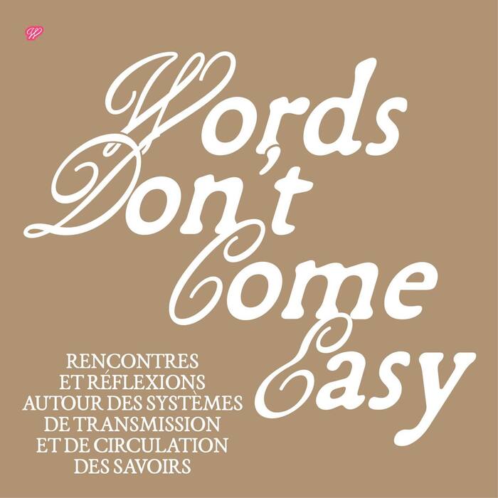
Words Don’t Come Easy Festival
The typography communicates intellectual warmth with a distinctly French literary sensibility—sophisticated yet approachable. The Garabosse family's dynamic form model, with its open apertures and subtle calligraphic warmth, creates an intimate scholarly atmosphere that invites contemplation. Cordier Script's decorative initials add ceremonial gravitas, positioning this as a curated cultural experience rather than casual entertainment.
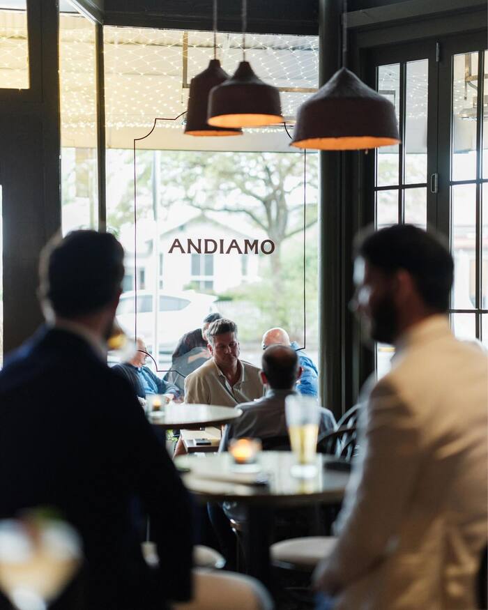
Andiamo, Herne Bay
AF Stelios brings a distinctly Mediterranean warmth through its dynamic form model—open apertures and subtle calligraphic stress create approachable sophistication rather than corporate polish. The typeface's balanced contrast and generous proportions communicate confident hospitality, while Cordier Script adds artisanal charm that grounds the brand in craft tradition. Together, they create an energy that's refined yet neighborly, sophisticated but never intimidating.