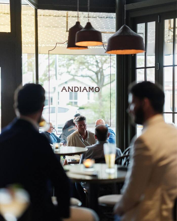
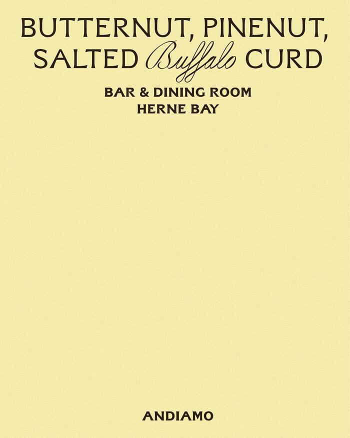
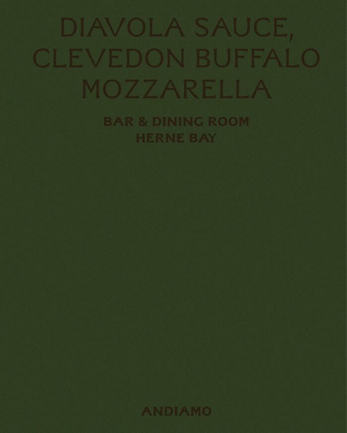
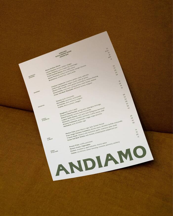
Andiamois a neighbourhood bar and eatery in Herne Bay, a suburb of Auckland, New Zealand. They recently partnered withStudio 024to reinvigorate a much-loved legacy brand, usingAF SteliosbyAbbr. Foundryas the main typeface, including for the wordmark. It is used together withSharp Type’sCordier Script. The challenge was to modernise the identity while staying true to its history and local roots. The refresh introduces a new wordmark grounded in heritage and sophistication, alongside a refined palette of rich greens and buttery yellows. Together, these elements bring warmth, confidence, and renewed clarity to the brand. The result is a considered evolution, honouring Andiamo’s past while setting it up for its next chapter on Herne Bay’s main strip.
AF Stelios brings a distinctly Mediterranean warmth through its dynamic form model—open apertures and subtle calligraphic stress create approachable sophistication rather than corporate polish. The typeface's balanced contrast and generous proportions communicate confident hospitality, while Cordier Script adds artisanal charm that grounds the brand in craft tradition. Together, they create an energy that's refined yet neighborly, sophisticated but never intimidating.
AF Stelios works perfectly for neighborhood dining because its dynamic form model (open counters, diagonal stress) creates warmth while maintaining the authority needed for professional hospitality. The moderate contrast and classical proportions reference European café culture without feeling forced or precious. Cordier Script's authentic script forms provide textural contrast and artisanal credibility, essential for food brands competing against corporate chains. The pairing bridges heritage craft with contemporary confidence.
This pairing follows contrast-with-cohesion principles beautifully—both fonts share a dynamic, warm character rooted in calligraphic tradition, but express it through different means. Stelios provides structured sophistication through refined sans-serif forms, while Cordier delivers organic authenticity through script flourishes. The shared Mediterranean warmth creates harmony, while the serif/script contrast generates clear hierarchy without stylistic discord.