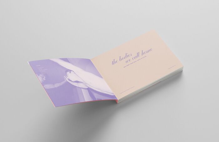
The Bodies We Call Homeis a student project created atArtCenter College of Designas part of the Type4 class taught byStephen Serrato. This publication is presented as a hypothetical art catalog, imagined as a curated collection of works exploring queer intimacy, resistance, and care. The catalog’s typography—featuringPlayground,Alegreya Sans,Editorial New, andEiko—balances playfulness, warmth, and editorial refinement. Together, these typefaces move between softness and structure, echoing the emotional vulnerability and resilience at the core of the work. Queerness has long been under attack—from historical criminalization to the government’s neglect during the AIDS crisis, where thousands of lives were lost in silence. Yet in the face of devastation, queer communities turned to intimacy as survival. Acts like the AIDS Quilt became declarations of love, grief, and resistance, proving that queer lives mattered. Today, anti-LGBTQ+ legislation and societal pressures echo those painful histories, politicizing queer bodies and threatening the right to exist freely. But intimacy remains a radical force—woven into activism, art, and quiet care shared between chosen families.Queer intimacy exists in the quiet moments of touch, in the unspoken understanding between lovers, and in the collective strength of chosen families. It is spiritual, physical, and emotional—a force that holds, heals, and empowers. Love, in all its forms, is an undeniable human right, yet, it remains under threat. The ability to love and be loved should never be taken away, for it is as essential as the air we breathe.
This multi-font system creates a tender yet activist energy that embodies queer resilience through typographic vulnerability. Playground's script forms bring intimate, handwritten warmth while Editorial New's high-contrast serifs provide editorial gravitas, creating a duality between personal touch and institutional authority. The dynamic apertures in Alegreya Sans and the experimental forms in Eiko add layers of openness and resistance, mirroring the catalog's themes of intimacy as radical act and chosen family as sanctuary.
This four-font system works through deliberate contrast between dynamic warmth and rational authority. Playground's script forms carry the most intimate energy with their flowing, personal character, while Editorial New's high-contrast transitional structure provides editorial credibility essential for an art catalog. Alegreya Sans offers a humanist counterpoint with open apertures and gentle proportions that bridge the script's warmth with the serif's formality. Eiko likely serves as an experimental accent, adding contemporary edge to prevent the system from becoming too precious.
This pairing violates traditional harmonic principles but succeeds through thematic necessity. The script-serif-sans-experimental quartet spans multiple form models—from Playground's dynamic calligraphic roots to Editorial New's rational vertical stress to Alegreya Sans's humanist openness. Rather than structural compatibility, the fonts create meaning through deliberate tension: intimate script against institutional serif, warm sans mediating between extremes, with Eiko providing contemporary punctuation that keeps the system from being nostalgic.