
Eiko
Eiko follows a rational construction model with closed apertures, vertical stress, and systematic letter forms that prioritize order over warmth. The contrast is minimal, with nearly uniform stroke weights throughout, creating the even typographic color essential for extended reading. Its apertures are moderately closed—particularly visible in letters like 'e' and 'a'—while maintaining sufficient counter space to prevent claustrophobia at text sizes. The face belongs to the neo-grotesque tradition but with softer, less rigid terminals than classic Swiss grotesques like Helvetica, suggesting a more contemporary sensibility. In practice, Eiko excels as a reliable workhorse for digital interfaces and corporate communications where clarity and neutrality are paramount, though it lacks the distinctive character needed for brands seeking strong typographic personality. Its rational bones make it predictable and safe, but also somewhat forgettable in a crowded field of similar sans-serifs.
The Bodies We Call Home
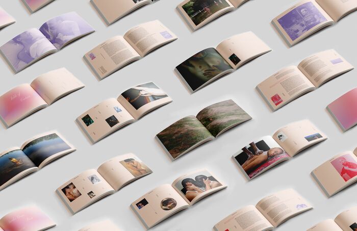
This multi-font system creates a tender yet activist energy that embodies queer resilience through typographic vulnerability. Playground's script forms bring intimate, handwritten warmth while Editorial New's high-contrast serifs provide editorial gravitas, creating a duality between personal touch and institutional authority. The dynamic apertures in Alegreya Sans and the experimental forms in Eiko add layers of openness and resistance, mirroring the catalog's themes of intimacy as radical act and chosen family as sanctuary.
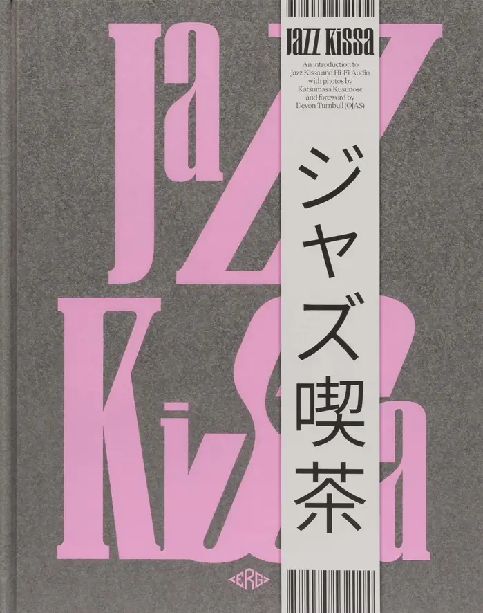
Jazz Kissa
WS Craft's biform letterforms create a deliberately unstable, syncopated rhythm that mirrors jazz's improvisational spirit—the alternating case heights generate visual polyrhythm on the page. Combined with Eiko's refined Japanese forms, this creates a cross-cultural dialogue between Western experimental typography and Eastern typographic precision, embodying the book's exploration of Japanese jazz café culture as both intimate and internationally connected.