


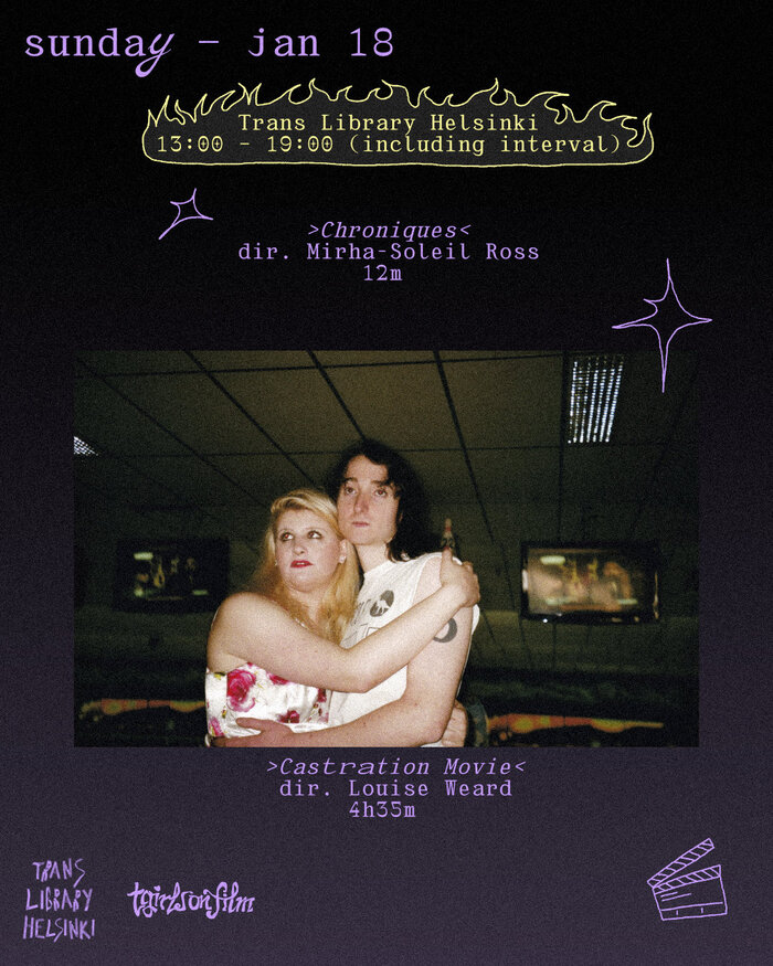
A3 announcement poster depicting a floating genderqueer symbol, casting a shadow The TGirlsonFilm Weekend Festival is a 3-day trans film festival organised byTrans Library HelsinkiandTGirlsonFilm. The poster and graphics are designed and illustrated by me,falk schröter, and combine the typefacesInterlopebyGabriel Dubourgand my ownmadleen text.
This typography system radiates radical intimacy through its deliberate imperfection and handmade warmth. Interlope's dynamic form model—with open apertures and organic irregularities—creates approachable accessibility while maintaining underground credibility. The pairing with the designer's own Madleen Text amplifies this tender defiance, where purposeful quirks in letterforms become acts of resistance against typographic conformity, perfectly embodying a trans film festival's ethos of authentic self-expression.
Interlope's dynamic form model serves the festival's radical accessibility perfectly—its open apertures and diagonal stress create warmth while irregular stroke weights suggest handmade authenticity over corporate polish. The organic inconsistencies in character widths and baseline positioning mirror the festival's celebration of non-conforming identities. Madleen Text's custom nature reinforces community ownership and DIY ethos, while its text-optimized proportions ensure legibility across poster formats without sacrificing the experimental edge essential for underground cultural credibility.
This pairing works through shared experimental DNA rather than strict structural harmony—both fonts embrace imperfection as a feature, not a bug. While they may not follow traditional form model compatibility (mixing dynamic display with custom text), they achieve cohesion through their mutual rejection of typographic orthodoxy. The custom nature of Madleen Text creates perfect brand ownership alongside Interlope's accessible irregularity, establishing hierarchy through authorship rather than conventional weight contrast.