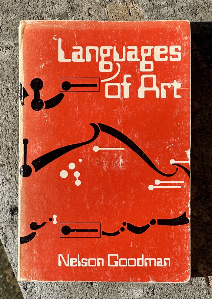
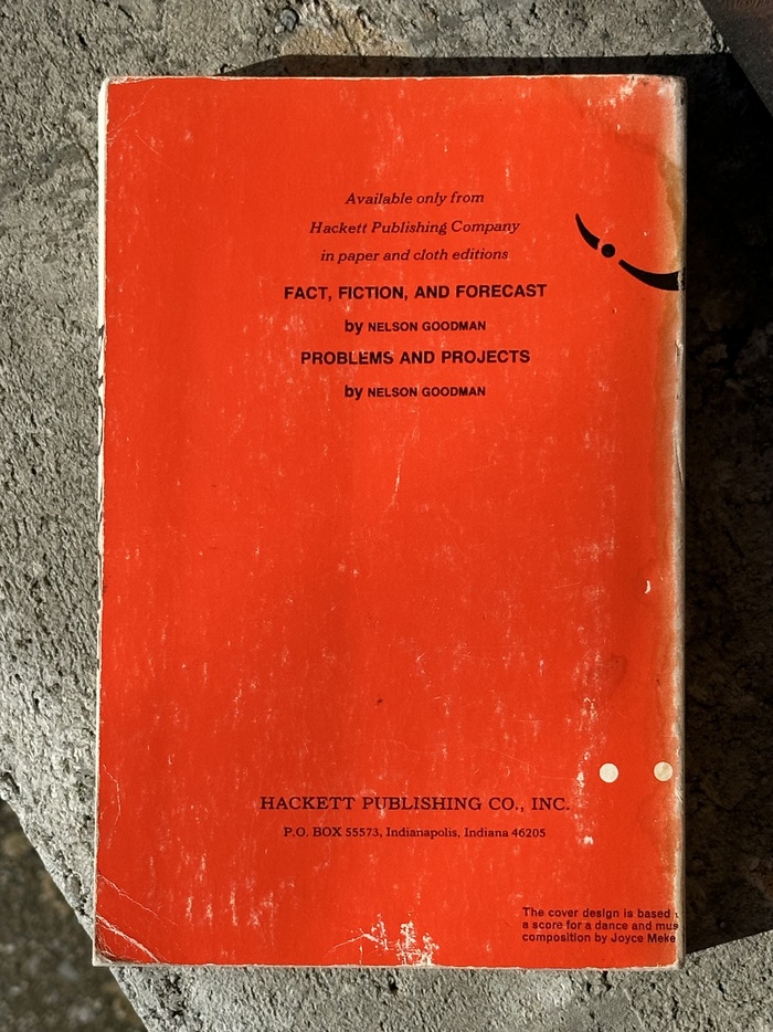
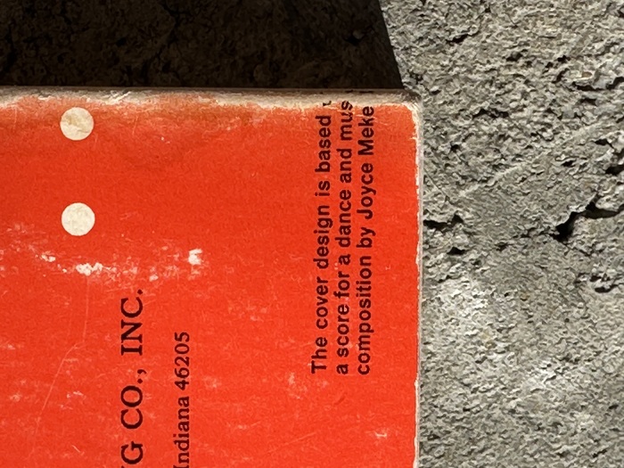

Languages of Art: An Approach to a Theory of Symbolsis a book by the American philosopher Nelson Goodman. It is a work of 20th century aesthetics in the analytic tradition. Originally published in 1968, it was revised in 1976. Goodman continued to refine and update these theories in essay form for the rest of his career. The cover design on this1976 paperbackby Bobbs-Merill is uncredited, but does say on the back cover, only partially visible on this well-worn copy: “The cover design is based on a score for a dance and musical composition byJoyce Mekeel.” I believe it matches theoriginal hardcover design from 1968.
This typography system embodies mid-century intellectual sophistication through the tension between Bookman's warm, rational serif authority and Helvetica's geometric neutrality. Bookman's closed apertures and vertical stress create scholarly gravitas while its slightly condensed proportions suggest analytical precision. The contrast with Helvetica's constructed forms establishes a dialogue between humanist tradition and modernist objectivity—perfectly mirroring Goodman's analytical philosophy bridging classical aesthetics and contemporary theory.
Bookman operates as a rational serif with moderate contrast and closed apertures, providing the authoritative backbone essential for academic credibility while avoiding the coldness of purely geometric forms. Helvetica's geometric construction and uniform stroke weights create systematic clarity for supporting text, its neutral voice allowing Goodman's complex theoretical arguments to speak without typographic interference. The pairing leverages different form models—rational versus geometric—to create intellectual hierarchy through structural differentiation rather than mere scale contrast.
This pairing deliberately violates Kupferschmid's harmonious pairing principles by crossing form models—rational serif with geometric sans—yet succeeds through careful calibration of scale and contrast. Both typefaces share vertical stress and similar x-height proportions, creating enough structural DNA to prevent discord while their different flesh (serif/sans, humanist/geometric) generates productive tension. The geometric Westminster adds a third voice that bridges the gap with its constructed letterforms, creating a triadic system where each font occupies a distinct conceptual position.