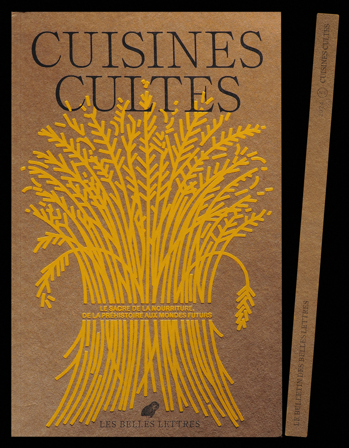


“Cuisines Cultes”, or “Cult Cuisine“ in English, is the fifth issue of the book-like magazine by French publisherLes Belles Lettres. It is dedicated to the rituals associated with food, from the prehistoric age to the future. It is filled with articles, recipes, photographies, short stories, and so on. The offset printed and gold stamped publication featuresSelf Modernin Regular, Book and Italic for the titles and texts, along withAlmanachfor the captions, andKarrikon the backcover. The Chinese text “民以食為天” appears to be set inHiragino Kaku Gothic. The typeface used for Greek text is yet unidentified.
This typography system channels intellectual curiosity through deliberate eclecticism, creating a scholarly-bohemian energy that feels both erudite and approachable. The Self Modern's rational proportions and controlled contrast establish editorial gravitas, while Almanach's dynamic warmth in captions softens the academic tone. This creates a brand personality that's intellectually rigorous yet culturally adventurous—perfect for a publication that treats food as anthropological subject matter rather than lifestyle content.
Self Modern's rational form model—with its closed apertures, vertical stress, and restrained contrast—provides the intellectual backbone appropriate for scholarly content about cultural rituals. Its extensive style range (Regular, Book, Italic) creates sophisticated hierarchy without relying on disparate fonts. Almanach serves as the perfect complement: its dynamic character and open forms bring warmth to captions while sharing Self Modern's humanist proportions. The multiscript approach with Hiragino Kaku Gothic demonstrates typographic cultural sensitivity, acknowledging the global nature of food culture through appropriate script choices.
This pairing exemplifies contrast-with-cohesion through shared rational proportions but different expressive registers. Self Modern's controlled, vertical authority pairs beautifully with Almanach's more open, dynamic character—they share similar x-heights and stem proportions but differ in aperture treatment and stroke contrast. The addition of culturally-appropriate fonts for Chinese and Greek text shows sophisticated understanding that typography should serve content authentically rather than forcing all languages through a single Western typeface.