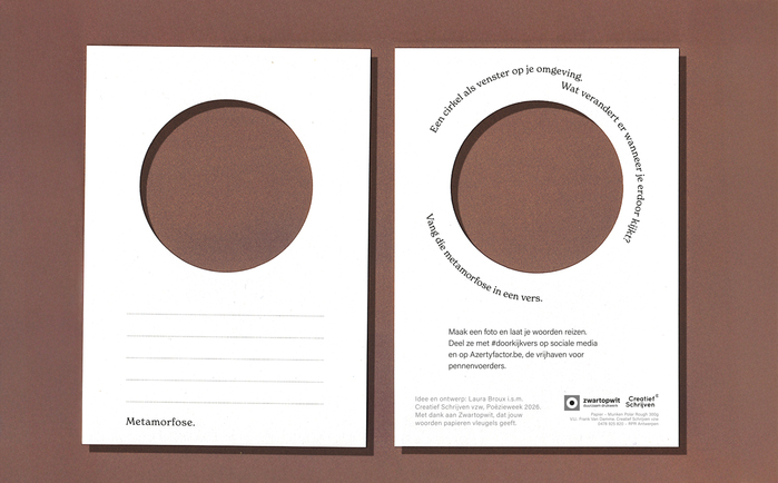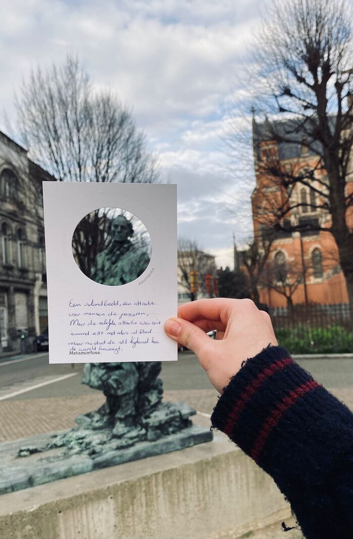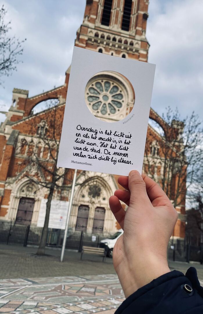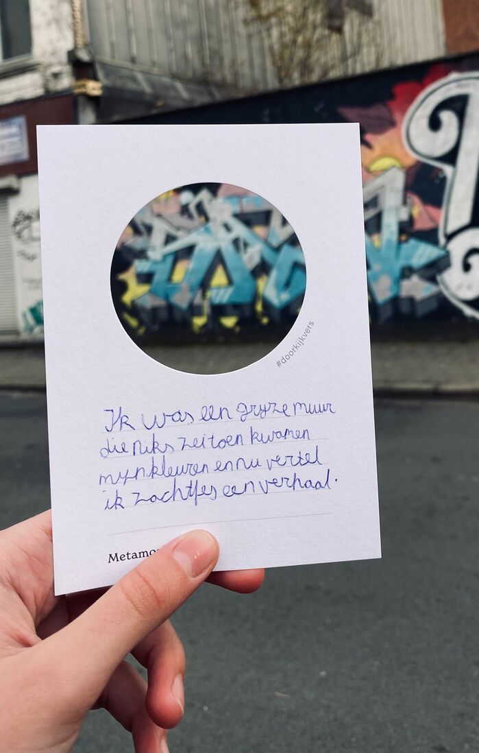


Doorkijkvers (“see-through verse”) is a self-initiated participatory poetry project by designerLaura Brouxcreated forPoëzieweek 2026. The project was developed and realized in collaboration withCreatief Schrijven vzwand printerZwartopwit.The project takes the form of an A6 card with a circular cut-out that functions as a lens. By framing a small detail in their surroundings, participants are invited to slow down, observe differently and write a short poem inspired by what they see.Responding to the Poëzieweek 2026 theme ‘Metamorphosis’, printed on the front of the card, the intervention explores how a simple shift in perspective can transform everyday scenes into language. Distributed across Flanders (Belgium) and activated in schools, libraries and literary spaces, #doorkijkvers connects visual perception, writing and public space. Thousands of people, including numerous schools and language institutes, took part in the project, contributing to a wide and diverse engagement with poetry across Flanders.
The typography creates an intellectual-accessible energy that bridges literary sophistication with democratic participation. Acumin's rational form model—with its closed apertures and vertical stress—provides authoritative clarity for instructional content, while New Spirit's dynamic characteristics and open letterforms invite contemplative engagement. The pairing suggests serious literary inquiry made approachable, embodying the project's mission to transform everyday observation into poetic language.
Acumin's rational grotesk structure provides the institutional credibility necessary for educational distribution across schools and libraries, its closed apertures and systematic weight range ensuring legibility at small sizes on A6 cards. New Spirit's dynamic form model—with warmer apertures and subtle calligraphic influences—creates a more intimate, contemplative voice for the poetic content. The contrast between rational instruction and dynamic inspiration mirrors the project's transformation of structured observation into creative expression.
This pairing employs the classic rational-dynamic contrast strategy, creating hierarchy through fundamentally different form models rather than mere weight variation. Acumin's closed, systematic structure handles the functional communication layer, while New Spirit's more open, humanist characteristics signal the creative transformation space. The deliberate structural tension reinforces the project's core concept of shifting from analytical observation to poetic interpretation.