
Acumin
Acumin exhibits a geometric form model with rationalized proportions, built on circular 'o' forms and systematic letter construction that prioritizes consistency over calligraphic warmth. The contrast level remains uniformly low across all weights, creating even typographic color with minimal thick-thin variation—a hallmark of contemporary neo-grotesque design. Its apertures strike a middle ground between geometric rigidity and humanist openness, with letters like 'a' and 'e' showing moderate openness that aids legibility without sacrificing the systematic character. The x-height runs generously proportioned relative to cap height, optimizing for screen readability while maintaining clean vertical proportions. Acumin belongs to the lineage of geometric sans serifs that emerged from Bauhaus principles but tempered with contemporary pragmatism—less doctrinaire than pure geometric faces like Futura, yet more systematic than humanist alternatives. In practice, this creates a versatile workhorse that performs reliably across digital interfaces and editorial contexts, though its geometric skeleton can feel cold in more expressive brand applications. The face excels in environments requiring systematic hierarchy and clean information architecture, but lacks the calligraphic warmth needed for more intimate or craft-oriented communications.
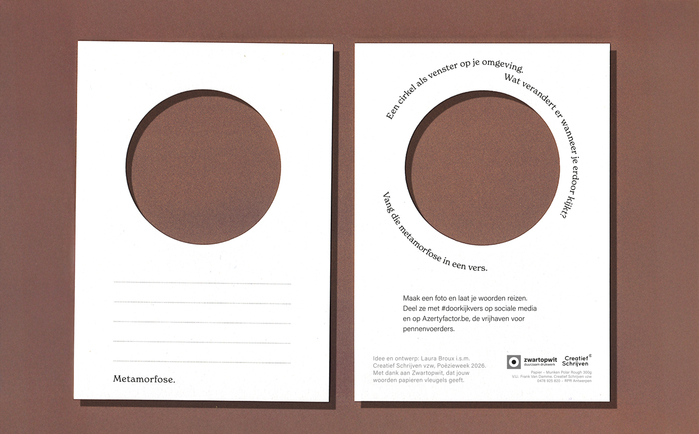
Doorkijkvers
The typography creates an intellectual-accessible energy that bridges literary sophistication with democratic participation. Acumin's rational form model—with its closed apertures and vertical stress—provides authoritative clarity for instructional content, while New Spirit's dynamic characteristics and open letterforms invite contemplative engagement. The pairing suggests serious literary inquiry made approachable, embodying the project's mission to transform everyday observation into poetic language.
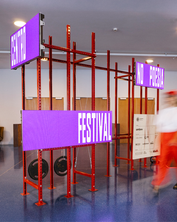
Poesia no Centro festival
The typography channels São Paulo's raw urban vernacular through Plaak's condensed, industrial forms — a geometric typeface with rational proportions that echoes utilitarian signage while maintaining cultural authenticity. The tight letterspacing and condensed widths create density and urgency, mirroring the festival's celebration of poetry within the city's visual cacophony. This isn't polished literary elegance but street-level cultural expression made typographic.