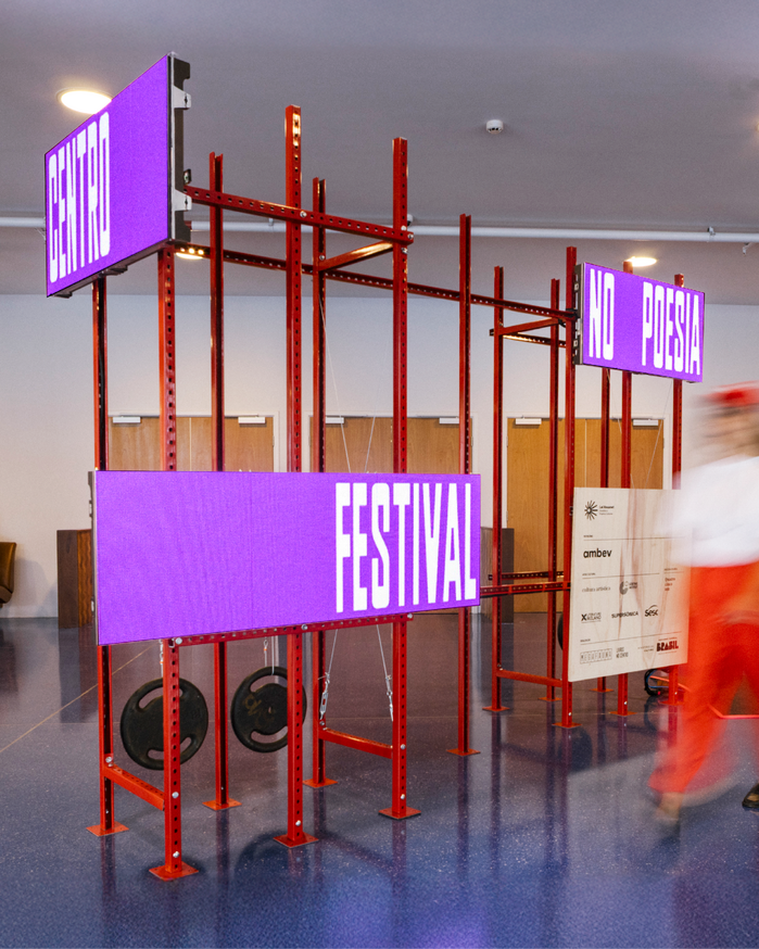
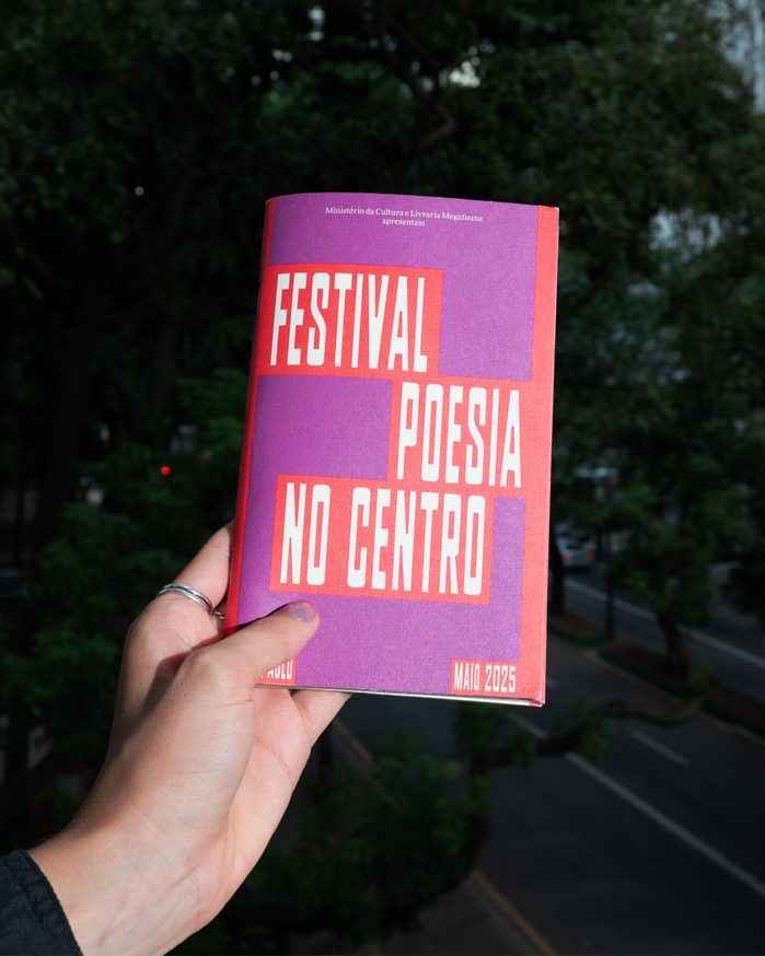
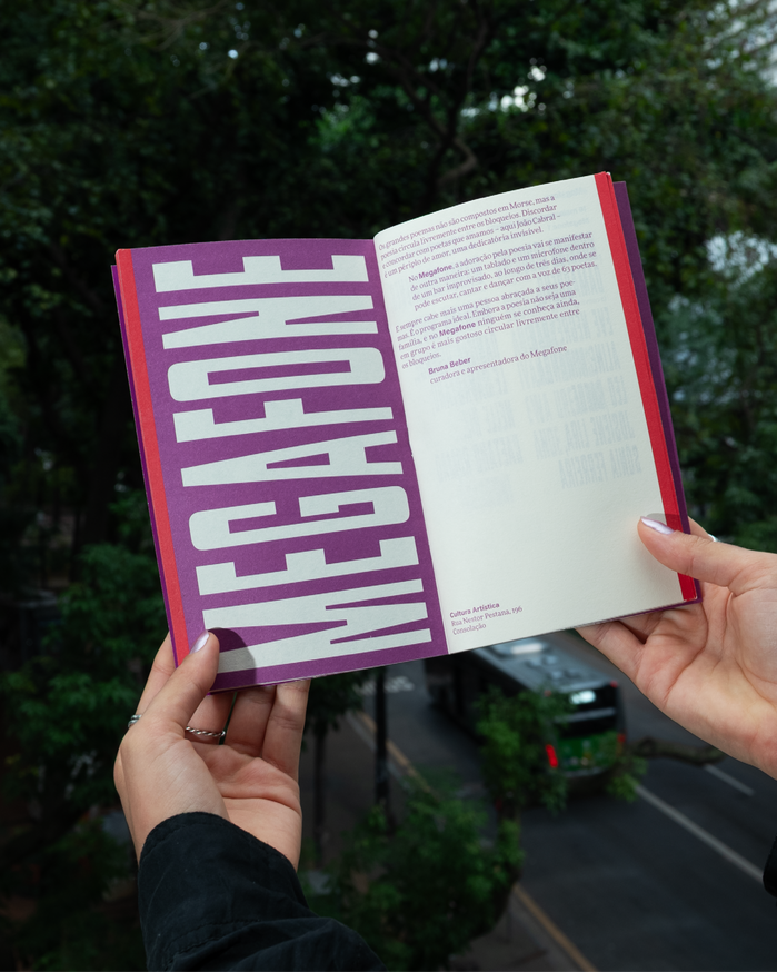
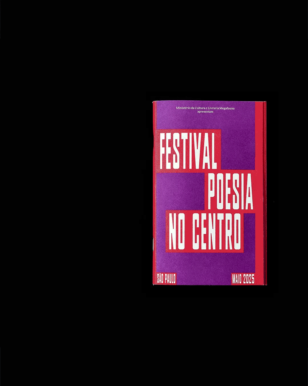
Poesia no Centrois a poetry festival promoted byMegafauna, a bookstore in São Paulo, Brazil. The visual identity and scenography allude to the city’s signage and urban cacophony, anchored in the use of thePlaaktypeface by the type foundry205TF, also present in the bookstore’s visual identity. The graphic design consists of a simple structure of boxes and vertical bars with moving typography superimposed on the work of guest photographer Mauro Restiffe. In the scenography, the lines become industrial shelving structures, the boxes become animated LED signs and the photographs become large-format posters.
The typography channels São Paulo's raw urban vernacular through Plaak's condensed, industrial forms — a geometric typeface with rational proportions that echoes utilitarian signage while maintaining cultural authenticity. The tight letterspacing and condensed widths create density and urgency, mirroring the festival's celebration of poetry within the city's visual cacophony. This isn't polished literary elegance but street-level cultural expression made typographic.
Plaak's geometric-rational form model with its constructed letterforms and vertical stress perfectly captures urban signage DNA while remaining highly legible at various scales from LED displays to embroidered caps. The condensed proportions maximize information density — essential for festival programming — while the typeface's industrial skeleton references São Paulo's commercial typography landscape. FF More and Acumin provide hierarchical support, likely offering different weights and optical sizes to maintain the system's utilitarian logic across applications.
The three-font system creates functional hierarchy rather than aesthetic contrast — Plaak anchors the identity with its distinctive condensed character, while FF More and Acumin likely serve as workhorse companions sharing similar rational construction principles. This approach prioritizes systematic clarity over stylistic tension, appropriate for a festival requiring complex information architecture. The pairing strategy emphasizes utility and readability across diverse touchpoints from digital signage to printed matter.