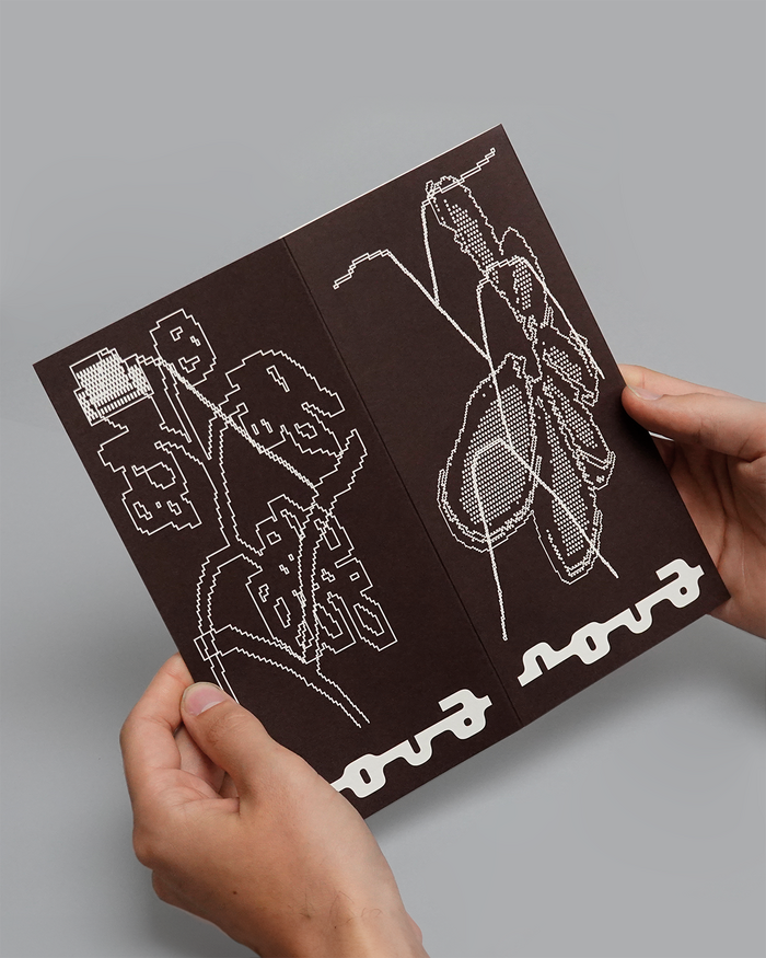
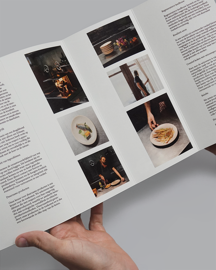
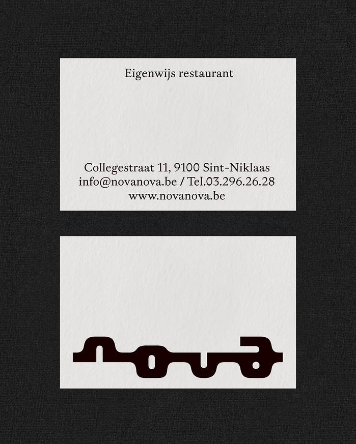
Corbin MahieuandVictor Verhelstcollaborated on a bold new identity forNova, combining unconventional monochrome illustrations and a logotype made withUrsa MonobyTekiowith classy typography featuringGaisyrbyDinamo Typefaces. On the website, the latter is substituted byLibre BaskervillebyImpallari Type. Nova is a creative fine-dining restaurant in Sint-Niklaas, Belgium, led by chef Guy De Jonghe, and offering an intimate experience for about twenty guests. It features a dailycarte blanchemenu rooted in local, seasonal, and ethical ingredients sourced primarily through short supply chains and close relationships with local farmers and producers. Nova operates with a strong sustainability philosophy, guided by its public “manifesto of fine food,” emphasizing innovation, zero waste, and a warm, collaborative atmosphere. It offers a refined yet principled cuisine that highlights purity, flavor, and creativity, often incorporating BBQ elements and inventive uses of local products.
The monospaced Ursa Mono logotype creates an unexpected tension for fine dining—its systematic, code-like rationality contrasts sharply with culinary artisanship, suggesting Nova's analytical approach to creativity and zero-waste innovation. ABC Gaisyr's dynamic letterforms with their open apertures and calligraphic warmth humanize the digital precision, while the Libre Baskerville substitution maintains editorial authority through high-contrast transitional forms that speak to the restaurant's manifesto-driven philosophy.
Ursa Mono's geometric construction and uniform character width creates systematic clarity that reflects Nova's methodical sustainability practices, while its softer terminals prevent coldness. ABC Gaisyr operates in the dynamic form model with moderate contrast and open counters, providing organic counterpoint to the mono's rationality. The pairing creates deliberate tension between systematic thinking (mono) and intuitive creativity (dynamic sans), perfectly embodying a restaurant that's both analytically rigorous and emotionally warm.
This represents a bold cross-matrix pairing: geometric monospace meets dynamic humanist, creating productive tension rather than harmony. The mono's systematic grid contrasts with Gaisyr's organic flow, but both share contemporary sensibilities and avoid excessive contrast. The Libre Baskerville web substitution shifts toward editorial authority with its high-contrast transitional forms, maintaining hierarchy while adding classical gravitas that speaks to culinary tradition reimagined through modern lens.