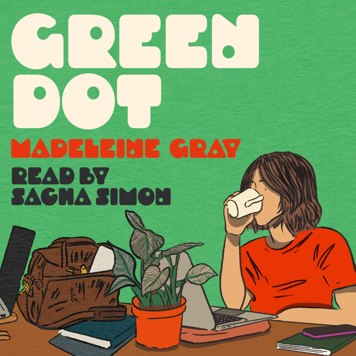


Green Dotis the first novel of writerMadeleine Gray. Published in the UK byWeidenfeld & Nicolson, the book was praised by Caitlin Moran for its humorous take on an office relationship, and was shortlisted for the 2025 British Book Awards Debut Fiction Book of the Year. The book and associated marketing make use of the fontDroog, designed byRian Hughesand released throughDevice. On the cover of the edition shown here, Droog is embossed in a glossy finish that gives tactile contrast to the flat, bold colours of the illustration. The title of the book references the ‘green dot’ that indicates a person’s presence online – a motif echoed visually by the circular font and its distinctive holes, some of which are used in lieu of counters. Cover design bySteve Markingwith illustration byTatyana Alanis.
Droog's geometric construction with its distinctive circular apertures creates a playful-digital energy that perfectly captures contemporary online culture. The typeface's systematic circular forms and technical precision communicate the algorithmic nature of digital presence (the "green dot" status indicator), while its unconventional counter replacements inject humor and personality—mirroring the novel's comedic take on modern office romance.
Droog operates within a geometric form model with constructed circular elements that directly echo the "green dot" online status metaphor central to the book's theme. Its distinctive feature—circular holes replacing traditional counters in select letters—creates visual puns that reinforce the digital connectivity narrative. The embossed application adds tactile luxury to what could be a cold geometric form, making the systematic construction feel approachable and premium rather than clinical.
The pairing with ITC Avant Garde Gothic maintains geometric consistency—both fonts share constructed, circular DNA from the same form model family. This creates harmonious hierarchy through scale and weight rather than contrasting typographic personalities. The shared geometric logic prevents visual discord while Avant Garde's more conventional letterforms provide readable support text that doesn't compete with Droog's distinctive character.