Graphic collection. 50 years of design in Portugal (1974–2024)exhibition, Expo 2025 Osaka
View source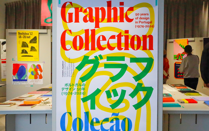
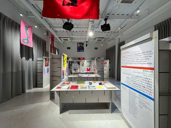
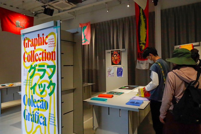

Graphic Collection: 50 Years of Design in Portugal (1974–2024)was on show earlier this year at thePortugal Pavilion,Expo 2025 Osaka, celebrating five decades of Portuguese graphic design. Curated byBarbara says…— Design Studioin collaboration with designerJosé Albergaria, under the joint venture Consórcio Gráfico, the exhibition brings together iconic works donated by designers and studios from across the country. The typefaces used on the exhibition’s visual identity and other materials areFlecha Brônzeafor titles andBasilarfor secondary information.Staff XX Condensedalso made an appearance on one of the exhibitionskinenstamps. The font(s) used for Japanese text are yet unidentified.
This typography system channels a distinctly Portuguese modernist sensibility—sophisticated yet approachable, rooted in geometric construction but warmed by subtle humanist inflections. Flecha Brônzea's high-contrast display forms create authoritative editorial presence while maintaining the playful edge characteristic of Portuguese graphic design's post-revolution creative explosion. The pairing suggests institutional gravitas tempered by cultural accessibility, perfect for presenting 50 years of design heritage to an international audience.
Flecha Brônzea operates as a rational display face with constructed geometric bones but dynamic aperture modulation that prevents sterility—crucial for representing Portugal's distinctive design voice that emerged after 1974. Its high contrast and vertical stress axis provide the editorial authority needed for museum-quality presentation, while Basilar's more neutral rational forms create clear information hierarchy without competing. The geometric underpinning of both faces reflects Portugal's modernist design legacy while their subtle warmth prevents the coldness that could alienate diverse Expo audiences.
This pairing follows sound structural logic: both faces share rational form models with vertical stress and controlled apertures, creating harmonious cohesion across the hierarchy. The contrast differentiation (Flecha Brônzea's high display contrast vs. Basilar's moderate text contrast) provides clear functional separation while maintaining visual DNA. Staff Condensed's appearance suggests thoughtful expansion of the system for space-constrained applications, likely sharing the geometric rational character that unifies the overall approach.