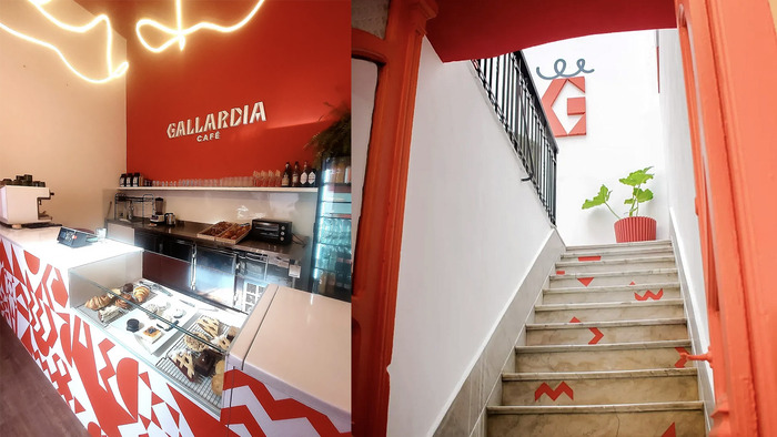
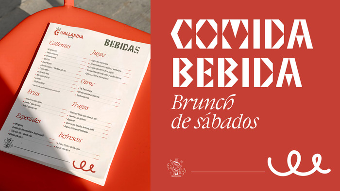
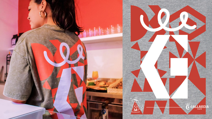
Gallardía’s visual identity was developed in collaboration with interior designer Elisa Uriarte, aligning the branding with the architecture of the historic house that hosts the café in Montevideo, Uruguay. The project responds to a distinct cultural context: while Uruguay has an emerging specialty coffee scene,mate—a traditional infusion widely consumed in theSouthern Cone—remains the dominant everyday beverage. Creating a brand with a strong presence within this landscape required selecting a typeface with greater weight and character, moving away from the neutrality of a standard sans serif to establish a more defined visual voice. The logomark references the café’s interior lighting concept, taking inspiration from the light strokes incorporated into the spatial design. For the launch campaign, phrases were developed to reflect Uruguay’s cultural backdrop, including “drinking coffee in a country that drinks mate.”
Blef's dynamic form model with open apertures and diagonal stress creates a warm, approachable energy that bridges artisanal craft with contemporary sophistication. The typeface carries enough weight and character to stand confidently against mate culture's dominance while maintaining the inviting accessibility essential for a neighborhood café, avoiding the sterile neutrality of rational grotesks in favor of something more culturally grounded and conversational.
Blef's selection demonstrates strategic typographic thinking for cultural positioning—its dynamic form model with calligraphic roots provides the "greater weight and character" needed to distinguish the brand in Uruguay's mate-dominated beverage landscape. The open apertures and diagonal stress create warmth that aligns with the historic house setting, while DaVinci likely serves as a more neutral companion for extended text, and Syne's geometric construction provides systematic clarity for wayfinding and menu applications.
The three-font system creates purposeful contrast across Kupferschmid's matrix—Blef's dynamic warmth for brand voice, DaVinci's rational authority for informational hierarchy, and Syne's geometric precision for systematic applications. This approach risks complexity but appears managed through clear functional roles, with each typeface serving distinct communication needs rather than competing for the same visual space.