
DaVinci
DaVinci follows a rational construction model with vertical stress and relatively closed apertures, creating an orderly, authoritative presence on the page. The typeface exhibits medium contrast between thick and thin strokes, with bracketed serifs that maintain clarity at smaller sizes while providing enough character for display use. Its proportions suggest contemporary refinement of transitional serif principles, with a moderate x-height that balances readability with elegance. The letterforms show careful attention to optical corrections and even typographic color, making it suitable for extended reading despite its somewhat formal character. However, the absence of italic styles significantly limits its hierarchical potential, constraining it to contexts where weight variation alone can establish sufficient contrast. DaVinci excels in corporate communications and editorial contexts that require trustworthy, professional typography but may feel too reserved for brands seeking warmth or approachability.
Gallardía
Blef's dynamic form model with open apertures and diagonal stress creates a warm, approachable energy that bridges artisanal craft with contemporary sophistication. The typeface carries enough weight and character to stand confidently against mate culture's dominance while maintaining the inviting accessibility essential for a neighborhood café, avoiding the sterile neutrality of rational grotesks in favor of something more culturally grounded and conversational.
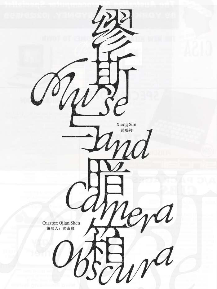
Murse & Camera Obscura
DaVinci's calligraphic heritage creates sophisticated cultural authority while maintaining approachable warmth through its dynamic form model and open apertures. The typeface bridges classical refinement with contemporary sensibility, embodying the kind of intellectual playfulness appropriate for a curated photography exhibition that synthesizes Eastern and Western artistic perspectives.