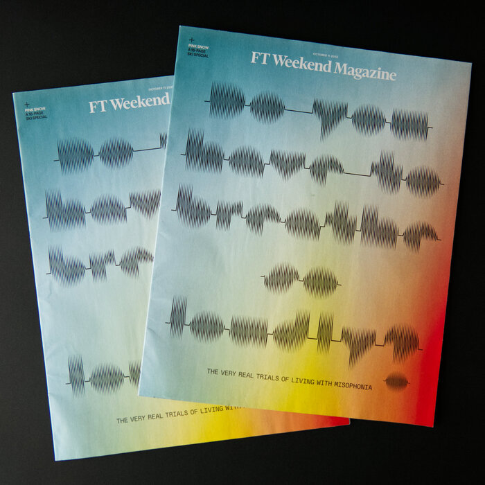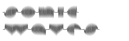
Sonic Waves exhibits a geometric form model with constructed letterforms built on circular and rectangular foundations, creating systematic, mathematically-derived shapes that prioritize visual impact over reading comfort. The typeface maintains uniform stroke weights with virtually no contrast, giving it a clean, modernist aesthetic typical of mid-century geometric sans serifs. Its distinguishing features include tightly closed apertures, compressed counters, and terminals that terminate with crisp, unadorned endings. The x-height appears moderately tall relative to the cap height, but the closed counter shapes and narrow set width compromise legibility at smaller sizes. This face belongs to the geometric display tradition pioneered by Futura and Avant Garde, but pushes further toward visual dynamism with its "waves" treatment—likely incorporating subtle curves or rhythmic elements that animate the otherwise rigid geometric skeleton. Sonic Waves excels as a headline and display face where its systematic construction creates strong typographic presence, but its closed forms and potential decorative elements make it unsuitable for sustained reading at text sizes.