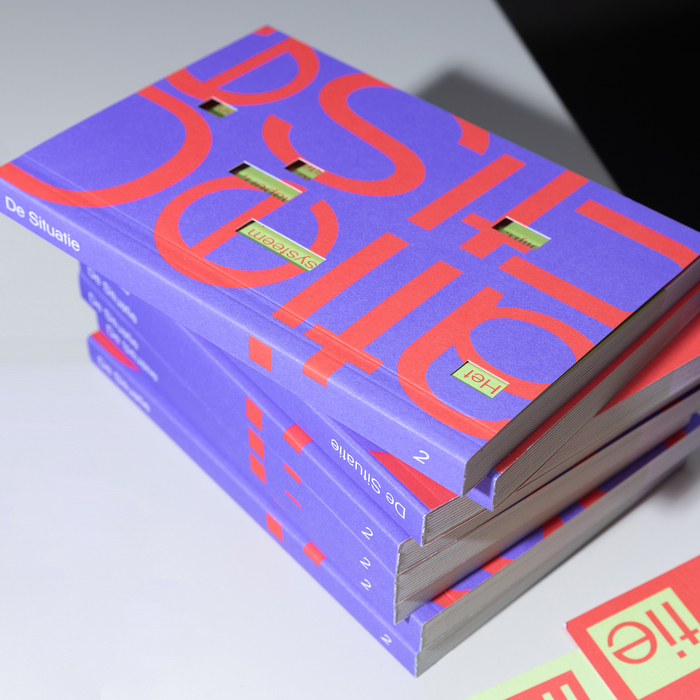
Segmentor is a geometric sans serif built on systematic construction principles, with circular 'o' forms and mathematically derived letterforms that immediately signal its modernist DNA. What distinguishes this face is its stencil treatment—strategic breaks in the letter forms that create visual breathing room while maintaining structural integrity. The contrast is completely absent, with uniform stroke weights throughout, and the apertures follow geometric logic with perfectly circular counters in 'o', 'p', 'q'. This is clearly a display-oriented design where the stencil breaks become a feature rather than a compromise, creating rhythm and texture at larger sizes. The missing italic variant confirms its role as a headline workhorse rather than a text system. While the geometric skeleton provides clean, systematic appeal, the stencil breaks prevent it from achieving the reading comfort necessary for extended text, making it purely a display performer that excels in branding and short-burst communication.