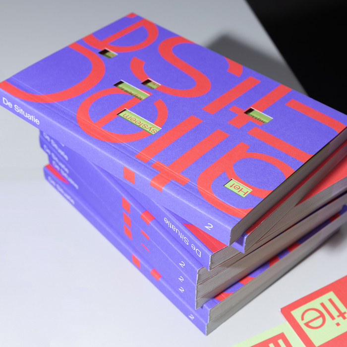
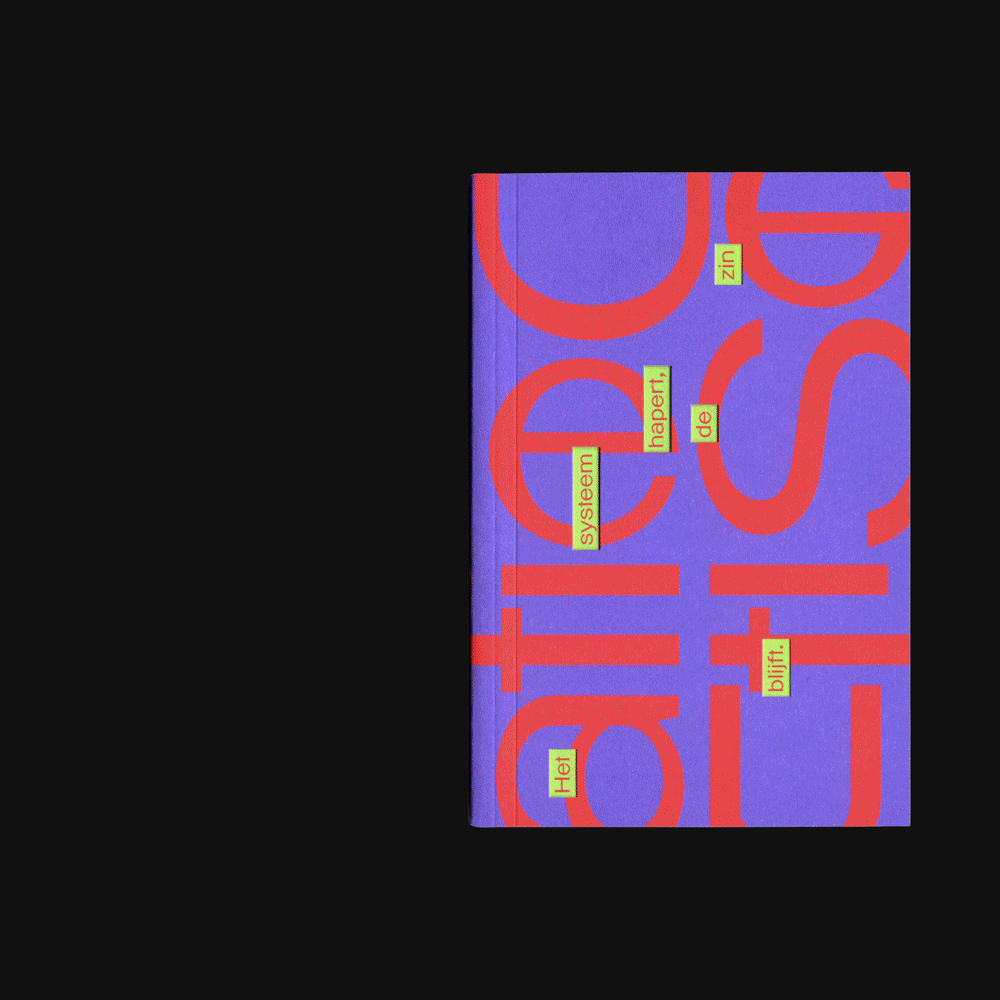
De Situatieis a literary platform and publication founded byPIP Den Haag, aimed at promoting the art of storytelling among young audiences by providing space for emerging writers and type designers alike. For thissecond publicationthey selected ten texts selected from De Situatie’s annual writing competition. For each text,All Sizesselected a unique typeface in close collaboration with type designerCéline Hurka. None of these typefaces had been published before, allowing writing talent and design talent to meet on equal footing. The texts are interspersed with half pages that are tilted in the reading direction, inspired by thedwarsliggerconcept—originally designed to make books readable with one hand. Within the context of De Situatie, this device also functions symbolically, reflecting the platform’s slightly off-axis position within the literary landscape. All editorial texts are placed on these half pages, reinforcing the relationship between form and content. Spencer Platt,Spencer EllenandSpencer Persisby Kaat Vandenbroeck
This typography system embodies democratic rebellion through radical diversity—thirteen different typefaces creating a deliberately fragmented, anti-hierarchical voice that mirrors the platform's mission to elevate emerging writers. The eclectic mix spans form models from geometric (Segmentor) to dynamic (handwritten specimens) to rational (monospace), with each text getting its own typographic identity. This creates an intentionally unstable, constantly shifting brand energy that rejects corporate consistency in favor of authentic multiplicity, positioning De Situatie as a genuinely experimental literary space where form follows content rather than brand guidelines.
The radical decision to assign unique, unpublished typefaces to each text transforms typography from brand tool to editorial medium, with each font functioning as a distinct voice rather than consistent brand marker. The inclusion of Celine Hurka's Segmentor alongside Tomorrow's offerings suggests careful curation toward experimental forms with strong character differentiation. The dwarsligger half-pages create optical disruption that mirrors the literary platform's "off-axis" positioning, using physical format to reinforce conceptual stance. This approach prioritizes typographic storytelling over brand recognition, with contrast levels and form models shifting dramatically across texts to serve individual narrative needs rather than unified visual identity.
Rather than traditional pairing, this system operates through radical juxtaposition—thirteen typefaces creating intentional typographic chaos that serves the anti-commercial, democratic ethos. The inclusion of both mono and proportional faces (LNT Natalia Mono vs. display specimens) suggests structural tension by design, with different form models deliberately clashing across texts rather than harmonizing. The physical format disruption (tilted half-pages) creates additional pairing tension between content typography and editorial elements, ensuring no single typographic voice dominates. This systematic inconsistency creates cohesion through shared rebellion against typographic orthodoxy.