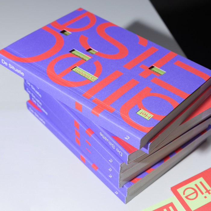
Pasara
Pasara follows a geometric form model with constructed circular letterforms and systematic proportions, built on a foundation of pure shapes rather than calligraphic gestures. Its stroke weight maintains complete uniformity throughout, creating the clean, engineered aesthetic typical of geometric sans-serifs in the Futura tradition. The apertures are moderately closed with precise, mathematically-derived curves that prioritize formal consistency over organic warmth. What distinguishes Pasara from classic geometric faces is its contemporary interpretation—softer corners and slightly more open counters suggest modern digital optimization. This typeface belongs to the lineage of constructed sans-serifs but shows restraint in avoiding the most extreme geometric dogma of pure circles and straight lines. In practice, Pasara excels as a display face where its systematic beauty can be appreciated at large sizes, but its closed apertures and uniform stroke weight would likely create poor readability in extended text settings, making it fundamentally a headline and branding tool rather than a text workhorse.