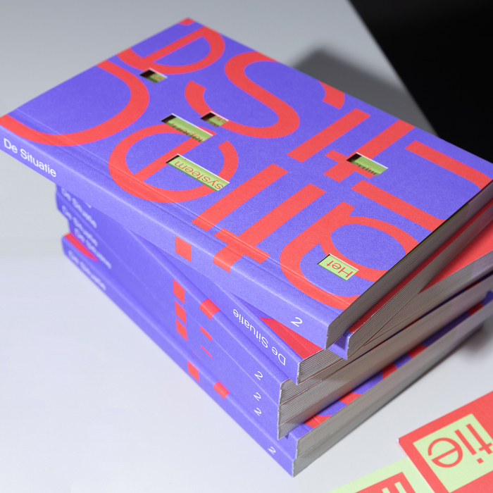
Gauche operates from a geometric skeleton with constructed circular forms and systematic proportions, exhibiting minimal stroke contrast and a vertical stress axis. The letterforms show deliberately simplified apertures and counters, with terminals that appear cut rather than naturally resolved—a hallmark of constructed display faces. Its x-height runs tall relative to cap height, creating dense text color but sacrificing the breathing room necessary for extended reading. This typeface belongs to the tradition of geometric sans-serifs but pushes toward more experimental territory, likely featuring unconventional character solutions that prioritize personality over legibility. Without italic support, Gauche reveals its true nature as a display-first design that trades functional completeness for distinctive voice. The face excels in large sizes where its constructed geometry can be appreciated, but its closed apertures and potentially narrow set width make it unsuitable for body text applications.
