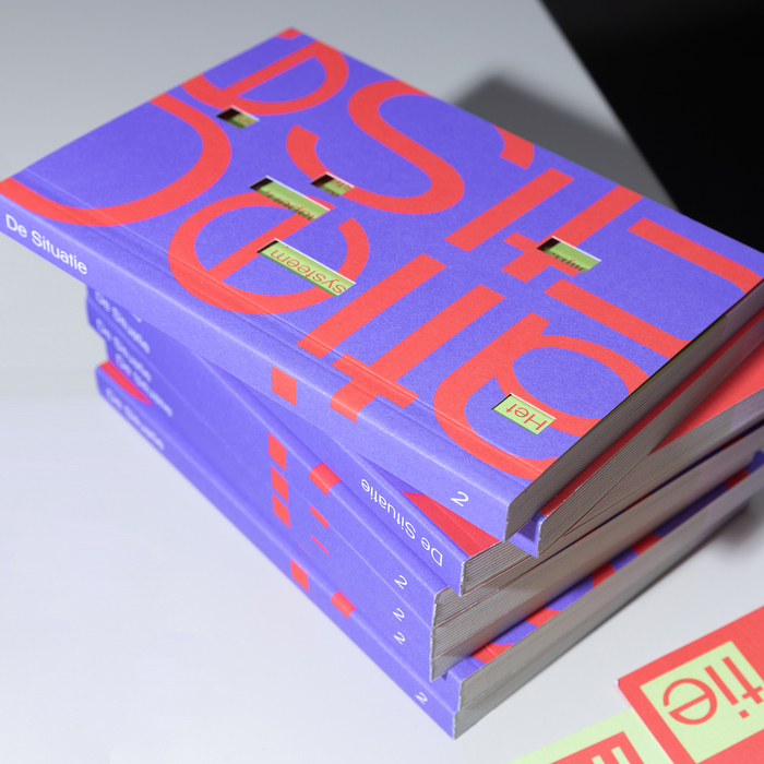
Klaar

Klaar follows the rational construction model with closed apertures, vertical stress axis, and orderly letter proportions that prioritize systematic consistency over calligraphic warmth. The stroke contrast is minimal, typical of neo-grotesque design, with uniform line weights that create even typographic color across extended text settings. Its apertures in letters like 'e', 'a', and 'c' are moderately closed, striking a balance between the hermetic closure of classic grotesques and the more open forms of humanist alternatives. The x-height appears well-proportioned relative to the cap height, neither too tall nor too compressed, which aids legibility in continuous reading contexts. This typeface belongs to the post-war Swiss tradition of rationalist sans-serifs, sharing DNA with Helvetica and Univers but likely developed for contemporary digital-first applications where screen rendering and cross-platform consistency are paramount. Klaar excels in environments demanding neutral, authoritative communication — corporate communications, technical documentation, and interface design where personality should not interfere with information transmission.
